The grid-template-rows property defines the number and size of the rows in a grid layout. The values of the grid-template-row property are separated by space. Each of the values specifies the row height.
| Initial Value | none |
| Applies to | Grid containers. |
| Inherited | No. |
| Animatable | Yes. The size of the rows is animatable. |
| Version | CSS Grid Layout Module Level 1 |
| DOM Syntax | object.style.gridTemplateRows = “20px 100px”; |
Syntax
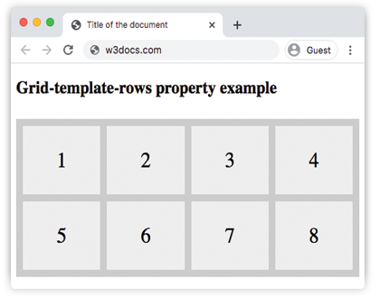
grid-template-rows: none | auto | max-content | min-content | flex | fit-content| repeat | length | initial | inherit;Example of the grid-template-row property:
<!DOCTYPE html>
<html>
  <head>
    <title>Title of the document</title>
    <style>
      .auto-container {
        display: grid;
        grid-template-columns: auto auto auto auto;
        grid-template-rows: auto auto;
        grid-gap: 10px;
        background-color: #ccc;
        padding: 10px;
        margin-top: 30px;
      }
      .auto-container > div {
        background-color: #eee;
        text-align: center;
        padding: 30px 0;
        font-size: 30px;
      }
    </style>
  </head>
  <body>
    <h2>Grid-template-rows property example</h2>
    <div class="auto-container">
      <div>1</div>
      <div>2</div>
      <div>3</div>
      <div>4</div>
      <div>5</div>
      <div>6</div>
      <div>7</div>
      <div>8</div>
    </div>
  </body>
</html>
Result
Example of the grid-template-row property with the specified size of rows:
<!DOCTYPE html>
<html>
  <head>
    <title>Title of the document</title>
    <style>
      .grid-container {
        display: grid;
        grid-template-columns: auto auto auto auto;
        grid-template-rows: 100px 300px;
        grid-gap: 10px;
        background-color: #ccc;
        padding: 10px;
      }
      .grid-container > div {
        background-color: #eee;
        text-align: center;
        padding: 20px 0;
        font-size: 30px;
      }
    </style>
  </head>
  <body>
    <h2>Grid-template-rows property example</h2>
    <div class="grid-container">
      <div>1</div>
      <div>2</div>
      <div>3</div>
      <div>4</div>
      <div>5</div>
      <div>6</div>
      <div>7</div>
      <div>8</div>
    </div>
  </body>
</html>