You can also create equal width columns for all devices (x-small, small, medium, large, x-large, and xx-large) through simply using the class .col, without specifying any column number.
Let’s try out the following example to understand how it exactly works:
Example
<div class="container">
    <!--Row with two equal columns-->
    <div class="row">
        <div class="col">Column one</div>
        <div class="col">Column two</div>
    </div>

    <!--Row with three equal columns-->
    <div class="row">
        <div class="col">Column one</div>
        <div class="col">Column two</div>
        <div class="col">Column three</div>
    </div>
</div>
Additionally, you can also set the width of one column and let the sibling columns automatically resize around it equally. You may use the predefined grid classes or inline widths.
If you try the following example you’ll find columns in a row with class .col has equal width.
Example
<div class="container">
    <!--Row with two equal columns-->
    <div class="row">
        <div class="col">Column one</div>
        <div class="col">Column two</div>
    </div>

    <!--Row with three columns divided in 1:2:1 ratio-->
    <div class="row">
        <div class="col">Column one</div>
        <div class="col-sm-6">Column two</div>
        <div class="col">Column three</div>
    </div>
</div>
Column Wrapping Behavior
Now we are going to create more flexible layouts that changes the column orientation based on the viewport size. The following example will create a three column layout on large devices like laptops and desktops, as well as on tablets (e.g. Apple iPad) in landscape mode, but on medium devices like tablets in portrait mode (768px ≤ screen width < 992px), it will change into a two column layout where the third column moves at the bottom of the first two columns.
Example
<div class="container">
    <div class="row">
        <div class="col-md-4 col-lg-3">Column one</div>
        <div class="col-md-8 col-lg-6">Column two</div>
        <div class="col-md-12 col-lg-3">Column three</div>
    </div>
</div>
As you can see in the example above the sum of the medium grid column numbers (i.e. col-md-*) is 3 + 9 + 12 = 24 > 12, therefore the third <div> element with the class .col-md-12 that is adding the extra columns beyond the maximum 12 columns in a .row, gets wrapped onto a new line as one contiguous unit on the medium screen size devices.
Similarly, you can create even more adaptable layouts for your websites using the Bootstrap’s grid column wrapping feature. Here’re some ready to use Bootstrap grid examples.
Creating Multi-Column Layouts with Bootstrap
With the new Bootstrap mobile first flexbox grid system you can easily control how your website layout will render on different types of devices that have different screen or viewport sizes like mobile phones, tablets, desktops, etc. Let’s consider the following illustration.
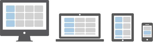
In the above illustration there are total 12 content boxes in all devices, but its placement varies according to the device screen size, like in mobile device the layout is rendered as one column grid layout which has 1 column and 12 rows placed above one another, whereas in tablet it is rendered as two column grid layout which has 2 columns and 6 rows.
Further, in large screen size devices like laptops and desktops it is rendered as three column grid layout which has 3 columns and 4 rows and finally in extra large screen devices like large desktops it is rendered as four column grid layout which has 4 columns and 3 rows.
Now the question is how we can create such responsive layouts using this Bootstrap flexbox grid system. Let’s start with the primary target device. Suppose our primary target device is laptop or normal desktop. Since our laptop layout has 3 columns and 4 rows i.e. 3×4 grid layout, so the HTML code for making such grid structure would look something like this.
Example
<div class="container-lg">
    <div class="row">
        <div class="col-xl-4"><p>Box 1</p></div>
        <div class="col-xl-4"><p>Box 2</p></div>
        <div class="col-xl-4"><p>Box 3</p></div>
        <div class="col-xl-4"><p>Box 4</p></div>
        <div class="col-xl-4"><p>Box 5</p></div>
        <div class="col-xl-4"><p>Box 6</p></div>
        <div class="col-xl-4"><p>Box 7</p></div>
        <div class="col-xl-4"><p>Box 8</p></div>
        <div class="col-xl-4"><p>Box 9</p></div>
        <div class="col-xl-4"><p>Box 10</p></div>
        <div class="col-xl-4"><p>Box 11</p></div>
        <div class="col-xl-4"><p>Box 12</p></div>
    </div>
</div>
Tip: The .container-lg class makes the container 100% wide if the width of the viewport is less than 992px, thus utilizing the full available width on smaller screens.
If you see the output of the above example in a large device such as a laptop or desktop which has screen or viewport width greater than or equal to 1200px but less than 1400px, you will find the layout has 4 rows where each row has 3 equal columns resulting in 3×4 grid layout.
Now it’s time to customize our layout for other devices. Let’s first start by customizing it for medium devices like tablets (768px ≤ viewport width < 1200px). Since on tablet our layout rendered as 2×6 grids (i.e. 2 columns and 6 rows). So, go ahead and add the class .col-md-6 on every column.
Example
<div class="container-lg">
    <div class="row">
        <div class="col-xl-4 col-md-6"><p>Box 1</p></div>
        <div class="col-xl-4 col-md-6"><p>Box 2</p></div>
        <div class="col-xl-4 col-md-6"><p>Box 3</p></div>
        <div class="col-xl-4 col-md-6"><p>Box 4</p></div>
        <div class="col-xl-4 col-md-6"><p>Box 5</p></div>
        <div class="col-xl-4 col-md-6"><p>Box 6</p></div>
        <div class="col-xl-4 col-md-6"><p>Box 7</p></div>
        <div class="col-xl-4 col-md-6"><p>Box 8</p></div>
        <div class="col-xl-4 col-md-6"><p>Box 9</p></div>
        <div class="col-xl-4 col-md-6"><p>Box 10</p></div>
        <div class="col-xl-4 col-md-6"><p>Box 11</p></div>
        <div class="col-xl-4 col-md-6"><p>Box 12</p></div>
    </div>
</div>
Tip: For convenience choose your primary target device and create layout for that device first after that add classes to make it responsive for other devices.
Similarly, you can customize the layout for extra extra large devices such as a large desktop screen by adding the class .col-xxl-3 on each column, as every row in that layout contains 4 columns (i.e. 4×3 grids layout). Here’s the final code after combining the whole process.
Example
<div class="container-lg">
    <div class="row">
        <div class="col-xl-4 col-md-6 col-xxl-3"><p>Box 1</p></div>
        <div class="col-xl-4 col-md-6 col-xxl-3"><p>Box 2</p></div>
        <div class="col-xl-4 col-md-6 col-xxl-3"><p>Box 3</p></div>
        <div class="col-xl-4 col-md-6 col-xxl-3"><p>Box 4</p></div>
        <div class="col-xl-4 col-md-6 col-xxl-3"><p>Box 5</p></div>
        <div class="col-xl-4 col-md-6 col-xxl-3"><p>Box 6</p></div>
        <div class="col-xl-4 col-md-6 col-xxl-3"><p>Box 7</p></div>
        <div class="col-xl-4 col-md-6 col-xxl-3"><p>Box 8</p></div>
        <div class="col-xl-4 col-md-6 col-xxl-3"><p>Box 9</p></div>
        <div class="col-xl-4 col-md-6 col-xxl-3"><p>Box 10</p></div>
        <div class="col-xl-4 col-md-6 col-xxl-3"><p>Box 11</p></div>
        <div class="col-xl-4 col-md-6 col-xxl-3"><p>Box 12</p></div>
    </div>
</div>
Tip: According to the above illustration there is no need to customize the layout for mobile phones; since columns on extra small devices will automatically become horizontal and rendered as 1×12 column grid layout in absence of .col-* or .col-sm-* classes.