You can also transform the text to lowercase, uppercase or make them capitalize.
Example
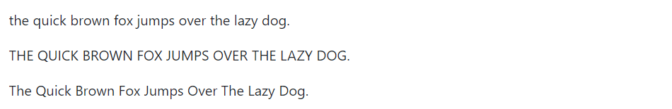
<p class="text-lowercase">The quick brown fox jumps over the lazy dog.</p>
<p class="text-uppercase">The quick brown fox jumps over the lazy dog.</p>
<p class="text-capitalize">The quick brown fox jumps over the lazy dog.</p>
— The output of the above example will look something like this:
Text Coloring
Colors are the powerful method of conveying important information in website design.
Bootstrap has handful of emphasis utility classes that can be used for this purpose such as showing success message in green color, warning or error message in red color, etc.
Example
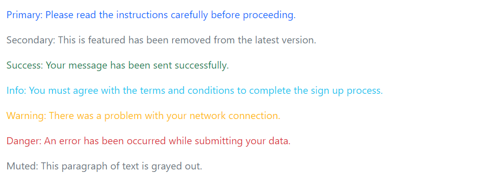
<p class="text-primary">Primary: Please read the instructions carefully before proceeding.</p>
<p class="text-secondary">Secondary: This is featured has been removed from the latest version.</p>
<p class="text-success">Success: Your message has been sent successfully.</p>
<p class="text-info">Info: You must agree with the terms and conditions to complete the sign up process.</p>
<p class="text-warning">Warning: There was a problem with your network connection.</p>
<p class="text-danger">Danger: An error has been occurred while submitting your data.</p>
<p class="text-muted">Muted: This paragraph of text is grayed out.</p>
— The output of the above example will look something like this:
Please, check out the Bootstrap helper classes chapter to learn about other text coloring and background coloring classes, as well as various other utility classes.
Styling Blockquotes
You can also give pretty look to your blockquotes — Just define the blockquotes using the standard <blockquote> element and bootstrap’s style sheet will do the rest.
Example
<blockquote class="blockquote">
    <p>Imagination is more important than knowledge.</p>
</blockquote>
— The output of the above example will look something like this:

When providing attribution, wrap your <blockquote> in a <figure> element and use a <figcaption> or a block level element (e.g., <p>) with the .blockquote-footer class, like this:
Example
<figure>
<blockquote class="blockquote">
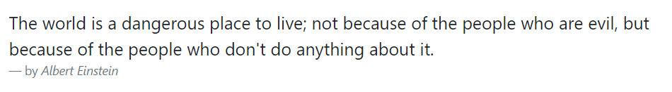
<p>The world is a dangerous place to live; not because of the people who are evil, but because of the people who don't do anything about it.</p>
</blockquote>
<figcaption class="blockquote-footer">by <cite>Albert Einstein</cite></figcaption>
</figure>— The output of the above example will look something like this:
You can also align blockquotes to the right or center by simply applying the text alignment classes .text-end or .text-center on the <blockquote> or <figure> element.
Truncating Long Text
For longer text, you can use the class .text-truncate to truncate the text with an ellipsis. The display property value of the element must be inline-block or block.
It is particularly helpful in a situation where you want to display a piece of text in a single line but there is no enough space available. Let’s try out an example and see how it works:
Example
<!-- Block level element -->
<div class="row">
    <div class="col-2 text-truncate">
        The quick brown fox jumps over the lazy dog.
    </div>
</div>

<!-- Inline level element -->
<span class="d-inline-block text-truncate" style="max-width: 100px;">
    The quick brown fox jumps over the lazy dog.
</span>
Text wrapping and Overflow
You can use the class .text-wrap to wrap the text within an element by overwriting its white-space property if it is set to pre or nowrap, such as Bootstrap badge components.
Similarly, you can use the class .text-nowrap to prevent text from wrapping within an element.
Let’s try out the following example to understand how it basically works:
Example
<div class="badge bg-primary text-wrap" style="width: 6rem;">
    This text will wrap.
</div>
<div class="bg-warning text-nowrap" style="width: 6rem;">
    This text will overflow the element's box.
</div>
Wrapping Long Word
You can use the class .text-break to prevent long word from breaking your layout.
Let’s try out the following example to understand how it basically works:
Example
<div class="row">
    <div class="col-2">
        <p class="text-break">veryveryveryveryveryveryverylongword</p>
    </div>
</div>