In this tutorial you will learn how to create elegant form layouts with Bootstrap.
Creating Forms with Bootstrap
HTML forms are an integral part of the web pages and applications, but creating the form layouts or styling the form controls manually one by one using CSS are often boring and tedious. Bootstrap greatly simplifies the process of styling and alignment of form controls like labels, input fields, selectboxes, textareas, buttons, etc. through predefined set of classes.
Bootstrap provides three different types of form layouts:
- Vertical Form (default form layout)
- Horizontal Form
- Inline Form
The following section will give you the detailed overview of all these form layouts as well as the various form related Bootstrap components one by one. Well let’s get started.
Creating Vertical Form Layout
To create vertical form layouts simply use the predefined margin utility classes for grouping the labels, form controls, optional form text, and form validation messages.
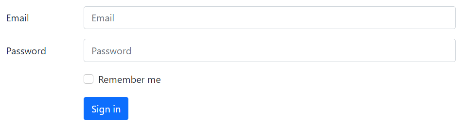
Here’s an example in which form controls are vertically stacked with labels on the top.
Example
<form>
    <div class="mb-3">
        <label class="form-label" for="inputEmail">Email</label>
        <input type="email" class="form-control" id="inputEmail" placeholder="Email">
    </div>
    <div class="mb-3">
        <label class="form-label" for="inputPassword">Password</label>
        <input type="password" class="form-control" id="inputPassword" placeholder="Password">
    </div>
    <div class="mb-3">
        <div class="form-check">
            <input class="form-check-input" type="checkbox" id="checkRemember">
            <label class="form-check-label" for="checkRemember">Remember me</label>
        </div>
    </div>
    <button type="submit" class="btn btn-primary">Sign in</button>
</form>
— The output of the above example will look something like this:
You will learn about custom checkboxes and other custom form controls in the next chapter.
Note: All textual form controls, such as <input> and <textarea> requires the class.form-control, while <select> requires the class .form-select for general styling. These classes also makes the forms controls 100% wide. To change their width or use them inline, you can utilize the Bootstrap’s predefined grid classes.
Tip: It is recommend to use margin-bottom utility classes (e.g., mb-2, mb-3, etc.) to add vertical spacing between the form groups. As, using single direction margin throughout in the form prevent margin collapsing and create more consist form.
Creating Horizontal Form Layout
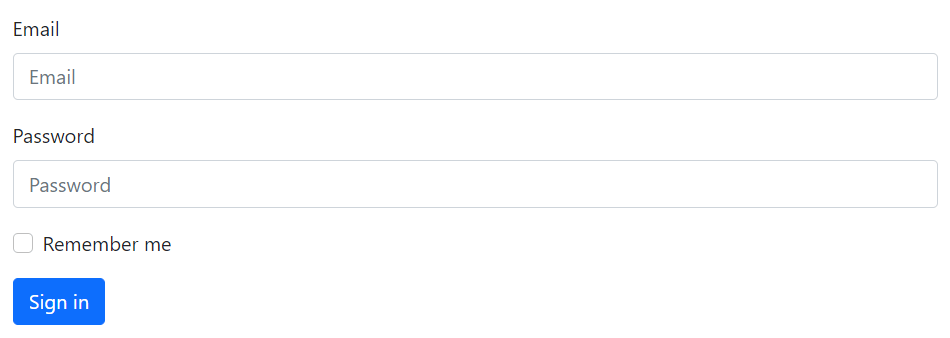
You can also create horizontal form layouts where labels and form controls are aligned side-by-side using the Bootstrap grid classes. To create a horizontal form layout add the class .row on form groups and use the .col-*-* grid classes to specify the width of your labels and controls.
Also, be sure to apply the class .col-form-label on the <label> elements, so that they’re vertically centered with their associated form controls. Let’s check out an example:
Example
<form>
    <div class="row mb-3">
        <label for="inputEmail" class="col-sm-2 col-form-label">Email</label>
        <div class="col-sm-10">
            <input type="email" class="form-control" id="inputEmail" placeholder="Email">
        </div>
    </div>
    <div class="row mb-3">
        <label for="inputPassword" class="col-sm-2 col-form-label">Password</label>
        <div class="col-sm-10">
            <input type="password" class="form-control" id="inputPassword" placeholder="Password">
        </div>
    </div>
    <div class="row mb-3">
        <div class="col-sm-10 offset-sm-2">
            <div class="form-check">
                    <input class="form-check-input" type="checkbox" id="checkRemember">
                    <label class="form-check-label" for="checkRemember">Remember me</label>
            </div>
        </div>
    </div>
    <div class="row">
        <div class="col-sm-10 offset-sm-2">
            <button type="submit" class="btn btn-primary">Sign in</button>
        </div>
    </div>
</form>
— The output of the above example will look something like this: