In this tutorial you will learn how to use the Bootstrap input group component.
Extending Form Controls with Bootstrap
Bootstrap input group component is a very flexible and powerful component for creating interactive and elegant form controls, however, it is limited to text input, select, and textarea only.
In the following sections you will see how to extend form controls by adding the text, icons and buttons before, after, or on both sides of it to make your form more attractive.
Creating Prepended and Appended Inputs
Input groups are created using the class .input-group. It act as a container for inputs and addons.
Further, wrap the text or icon in a <span> element as well as apply the class .input-group-text on it and place it before or after the input. Let’s take a look at the following example:
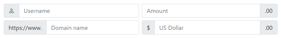
Example
<div class="row g-2">
    <div class="col-6">
        <div class="input-group">
            <span class="input-group-text">
                <span class="bi-person"></span>
            </span>
            <input type="text" class="form-control" placeholder="Username">
        </div>
    </div>
    <div class="col-6">
        <div class="input-group">
            <input type="text" class="form-control" placeholder="Amount">
            <span class="input-group-text">.00</span>
        </div>
    </div>
    <div class="col-6">
        <div class="input-group">
            <span class="input-group-text">https://www.</span>
            <input type="text" class="form-control" placeholder="Domain name">
        </div>
    </div>
    <div class="col-6">
        <div class="input-group">
            <span class="input-group-text">$</span>
            <input type="text" class="form-control" placeholder="US Dollar">
            <span class="input-group-text">.00</span>
        </div>
    </div>
</div>
— The output of the above example will look something like this:
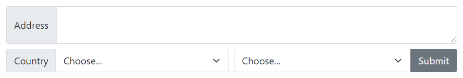
Since Bootstrap 5 you can also prepend or append select box dropdown and textarea form controls. Let’s try out the following example and see how it basically works:
Example
<div class="row g-2">
    <div class="col-12">
        <div class="input-group">
            <span class="input-group-text">Address</span>
            <textarea class="form-control"></textarea>
        </div>
    </div>
    <div class="col-6">
        <div class="input-group">
            <label class="input-group-text">Country</label>
            <select class="form-select">
                <option selected>Choose...</option>
                <option>France</option>
                <option>Germany</option>
                <option>Hungary</option>
            </select>
        </div>
    </div>
    <div class="col-6">
        <div class="input-group">
            <select class="form-select">
                <option selected>Choose...</option>
                <option>One</option>
                <option>Two</option>
                <option>Three</option>
            </select>
            <button type="button" class="btn btn-secondary">Submit</button>
        </div>
    </div>
</div>
— The output of the above example will look something like this:
Similarly, you can prepend or append addons to Bootstrap’s custom file input, like this:
Example
<div class="input-group">
    <input type="file" class="form-control">
    <button type="button" class="btn btn-secondary">Upload</button>
</div>
— The output of the above example will look something like this:
