Similarly, you can place checkbox or radio button within input group’s addon instead of text.
Example
<div class="row">
    <div class="col-6">
        <div class="input-group">
            <span class="input-group-text">
                <input type="checkbox" class="form-check-input mt-0">
            </span>
            <input type="text" class="form-control">
        </div>
    </div>
    <div class="col-6">
        <div class="input-group">
            <span class="input-group-text">
                <input type="radio" class="form-check-input mt-0">
            </span>
            <input type="text" class="form-control">
        </div>
    </div>
</div>
— The output of the above example will look something like this:

Placing Multiple Inputs or Addons
You can also place multiple inputs side-by-side within an input group easily, like this:
Example
<div class="input-group">
    <span class="input-group-text">Your Name</span>
    <input type="text" class="form-control" placeholder="First name">
    <input type="text" class="form-control" placeholder="Last name">
</div>
— The output of the above example will look something like this:

Similarly, you can also place multiple addons side-by-side within an input group. You can also mix it with checkbox and radio inputs, as shown in the following example:
Example
<div class="row">
    <div class="col-6">
        <div class="input-group">
            <span class="input-group-text">
                <input type="checkbox" class="form-check-input mt-0">
            </span>
            <span class="input-group-text">$</span>
            <input type="text" class="form-control">
        </div>
    </div>
    <div class="col-6">
        <div class="input-group">
            <span class="input-group-text">$</span>
            <span class="input-group-text">0.00</span>
            <input type="text" class="form-control">
        </div>
    </div>
</div>
— The output of the above example will look something like this:

Buttons Addons for Form Controls
You can also prepend or append buttons to the form controls like text. Simply, place as many buttons as you like within the .input-group, as shown in the following example:
Example
<div class="row">
    <div class="col-5">
        <div class="input-group">
            <input type="text" class="form-control" placeholder="Search...">
            <button type="button" class="btn btn-secondary">
                <i class="bi-search"></i>
            </button>
        </div>
    </div>
    <div class="col-7">
        <div class="input-group">
            <input type="text" class="form-control" placeholder="Type something...">
            <button type="submit" class="btn btn-primary">Submit</button>
            <button type="reset" class="btn btn-danger">Reset</button>
        </div>
    </div>
</div>
— The output of the above example will look something like this:

Adding Button Dropdowns
You can even add buttons with dropdowns to a form control if you want to perform more than one action from a button. Also, in case of input group you don’t need the .dropdown wrapper element, which is otherwise normally required. Let’s check out an example:
Example
<div class="row">
    <div class="col-6">
        <div class="input-group">
            <button type="button" class="btn btn-outline-secondary dropdown-toggle" data-bs-toggle="dropdown">Dropdown</button>
            <div class="dropdown-menu">
                <a href="#" class="dropdown-item">Action</a>
                <a href="#" class="dropdown-item">Another action</a>
            </div>
            <input type="text" class="form-control">
        </div>
    </div>
    <div class="col-6">
        <div class="input-group">
            <input type="text" class="form-control">
            <button type="button" class="btn btn-outline-secondary dropdown-toggle" data-bs-toggle="dropdown">Dropdown</button>
            <div class="dropdown-menu">
                <a href="#" class="dropdown-item">Action</a>
                <a href="#" class="dropdown-item">Another action</a>
            </div>
        </div>
    </div>
</div>
— The output of the above example will look something like this:

Adding Segmented Dropdown Button Groups
Similarly, you can define the segmented dropdown button group where dropdown button is placed besides the other buttons, as shown in the following example:
Example
<div class="row">
    <div class="col-6">
        <div class="input-group">
            <button type="button" class="btn btn-outline-secondary">Action</button>
            <button type="button" class="btn btn-outline-secondary dropdown-toggle dropdown-toggle-split" data-bs-toggle="dropdown">
                <span class="visually-hidden">Toggle Dropdown</span>
            </button>
            <div class="dropdown-menu">
                <a href="#" class="dropdown-item">Action</a>
                <a href="#" class="dropdown-item">Another action</a>
            </div>
            <input type="text" class="form-control">
        </div>
    </div>
    <div class="col-6">
        <div class="input-group">
            <input type="text" class="form-control">
            <button type="button" class="btn btn-outline-secondary">Action</button>
            <button type="button" class="btn btn-outline-secondary dropdown-toggle dropdown-toggle-split" data-bs-toggle="dropdown">
                <span class="visually-hidden">Toggle Dropdown</span>
            </button>
            <div class="dropdown-menu">
                <a href="#" class="dropdown-item">Action</a>
                <a href="#" class="dropdown-item">Another action</a>
            </div>
        </div>
    </div>
</div>
— The output of the above example will look something like this:

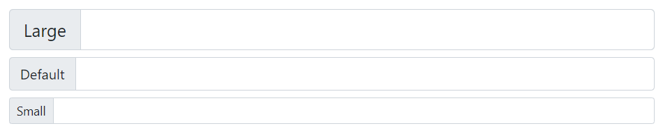
Height Sizing of Input Groups
You can also add the relative form sizing classes such as .input-group-lg or .input-group-sm to the .input-group element itself to make it larger or smaller in height.
The contents within the .input-group will automatically resize — there is no need for repeating the form control size classes on each element. Here’s an example:
Example
<!-- Larger input group -->
<div class="input-group input-group-lg">
    <span class="input-group-text">Large</span>
    <input type="text" class="form-control">
</div>

<!-- Default input group -->
<div class="input-group mt-2">
    <span class="input-group-text">Default</span>
    <input type="text" class="form-control">
</div>

<!-- Smaller input group -->
<div class="input-group input-group-sm mt-2">
    <span class="input-group-text">Small</span>
    <input type="text" class="form-control">
</div>
— The output of the above example will look something like this: