Bootstrap gives you option further to scaling a button up or down.
To make buttons larger add an extra class .btn-lg to the buttons, like this:
Example
<button type="button" class="btn btn-primary btn-lg">Large button</button>
<button type="button" class="btn btn-secondary btn-lg">Large button</button>
— The output of the above example will look something like this:

Similarly, to make buttons smaller add an extra class .btn-sm to the buttons, like this:
Example
<button type="button" class="btn btn-primary btn-sm">Small button</button>
<button type="button" class="btn btn-secondary btn-sm">Small button</button>
— The output of the above example will look something like this:

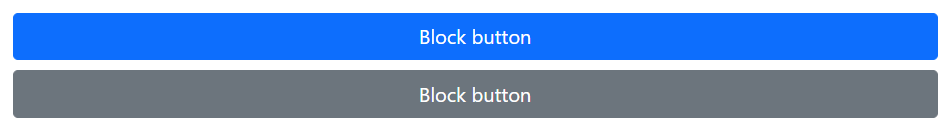
You can also create full-width or block buttons (buttons that covers the full width of the parent elements) through using the Bootstrap’s display and gap utility classes. These utilities offers much greater control over spacing, alignment, and responsive behaviors.
Example
<div class="d-grid gap-2">
    <button type="button" class="btn btn-primary">Block button</button>
    <button type="button" class="btn btn-secondary">Block button</button>
</div>
— The output of the above example will look something like this:
You can also create responsive variation of these buttons using the .d-{breakpoint}-block classes.
In the following example buttons will be vertically stacked on small and extra small devices (i.e. viewport width <768px). From medium (md) breakpoint up .d-md-block replaces the .d-grid class, thus nullifying the .gap-2 class. Let’s try it out and see how it really works:
Example
<div class="d-grid gap-2 d-md-block">
    <button type="button" class="btn btn-primary">Button</button>
    <button type="button" class="btn btn-secondary">Button</button>
</div>
Bootstrap Disabled Buttons
Sometimes we need to disable a button for certain reasons, for example, a user in case is not eligible to perform this particular action, or we want to ensure that user should performed all other required actions before proceed to this particular action. Let’s see how to do that.
Creating Disabled Buttons Using Button and Input Element
Buttons created through <button> or <input> tag can be disabled by adding the disabled attribute to the respective element, as shown in the following example:
Example
<button type="button" class="btn btn-primary" disabled>Primary button</button>
<button type="button" class="btn btn-secondary" disabled>Secondary button</button>
— The output of the above example will look something like this:

Creating Disabled Buttons Using Anchor Elements
Buttons created through <a> tag can be disabled by adding the class .disabled, like this:
Example
<a href="#" class="btn btn-primary disabled">Primary link</a>
<a href="#" class="btn btn-secondary disabled">Secondary link</a>
— The output of the above example will look something like this:

Note: The .disabled class only make links visually appear like disabled, however the link will remain clickable unless you remove the href attribute from it. Alternatively, you could implement custom JavaScript to prevent those clicks.
Bootstrap Active Buttons
Moreover, you can also apply the class .active to force the buttons look like active (i.e. pressed). Usually you don’t need to add this class to the buttons, as their active state is automatically styled by the Bootstrap using CSS :active pseudo-class. Here’s an example:
Example
<button type="button" class="btn btn-primary active">Primary button</button>
<button type="button" class="btn btn-secondary active">Secondary button</button>
— The output of the above example will look something like this:
