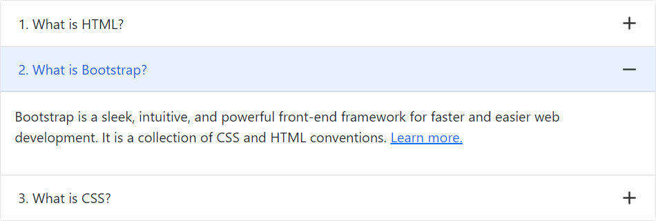
You can also use plus minus icons in the Bootstrap accordion widget (in place of chevron down and up icons) with a few lines of custom CSS code. Let’s try out the following example:
Example
<style>
.accordion-button::after {
    background-image: url("data:image/svg+xml,%3csvg viewBox='0 0 16 16' fill='%23333' xmlns='http://www.w3.org/2000/svg'%3e%3cpath fill-rule='evenodd' d='M8 0a1 1 0 0 1 1 1v6h6a1 1 0 1 1 0 2H9v6a1 1 0 1 1-2 0V9H1a1 1 0 0 1 0-2h6V1a1 1 0 0 1 1-1z' clip-rule='evenodd'/%3e%3c/svg%3e");
    transform: scale(0.75) !important;
}
.accordion-button:not(.collapsed)::after {
    background-image: url("data:image/svg+xml,%3csvg viewBox='0 0 16 16' fill='%23333' xmlns='http://www.w3.org/2000/svg'%3e%3cpath fill-rule='evenodd' d='M0 8a1 1 0 0 1 1-1h14a1 1 0 1 1 0 2H1a1 1 0 0 1-1-1z' clip-rule='evenodd'/%3e%3c/svg%3e");
}
</style>
— The output of the above example will look something like this: