In this article, we will learn how to hide the password field in a form using HTML. At the beginning of this article, we will learn some HTML basics, <form> tag and password element. After that, we can understand this concept with some examples.
What do you mean by HTML?
HTML stands for Hypertext Markup language. The latest HTML version is HTML5. HTML is the standard markup language for building and designing web pages.
In HTML, we can use various commands called tags. Tags are instructions that are embedded directly into the text of an HTML document. Each HTML tag specifies some action that the browser displays on a web page.
<form> tag in HTML
It is one of the important elements of HTML. The <form> tag consists of two mandatory attributes and some optional attributes.
<Input> element
The input element is used to insert various controls in the form, such as text boxes, files, passwords, emails, etc. The input element is applied in the form using <input> tag.
<input type = “password” >
Password can also be the part of the data entered in HTML forms. Instead of displaying original characters, either asterisk (*) or dots (.) are shown when a password is entered. Thus the entered characters are masked or hidden. To make a textbox that can hide the entered characters, the type attribute of <input> element should be set to “password.”
Syntax:
<input type ="password" name ="name_of_password_box"> All the attributes used with textbox are also supported by password input element.
The various attributes used with <input type = “password” > are given below:
- Size: It specifies the size or width of the <input type = “password” > box. If the user enters more characters than the specified size, the characters are automatically scrolled to the left.
For Example: <input type=”password” size =”20″ > - Placeholder: It specifies a short hint that describes an input field’s expected value (e.g., a sample value or a short description of the expected format). This hint is displayed in the input field before the user enters a value.
For Example: <input type=”password” size =”20″ placeholder=” Enter the value of Password”> - Maxlength: It specifies the maximum number of characters that can be entered in the <input type = “password” > box by the user.
For Example: <input type=”password” size =”20″ maxlength =”20″ placeholder=”Password”> - Min length: It specifies the minimum number of characters that can be entered in the <input type = “password” > box by the user.
For Example: <input type=”password” size =”20″ Minlength =”20″ placeholder=”Password”> - Value: It specifies the default text that will appear in the <input type = “password” > box when the form is initially loaded in the browser.
For Example: <input type=”password” size =”20″ Minlength =”20″ placeholder=”Password” value =” Enter Password” >
Let’s explain the <input> element with the help of various examples:
<! DOCTYPE html>
<html>
<head>
<title>
Password hide in HTML
</title>
<meta name="viewport" content="width=device-width, initial-scale=1">
<head>
<link rel="stylesheet" href="https://maxcdn.bootstrapcdn.com/bootstrap/4.0.0/css/bootstrap.min.css">
<style>
body {
  background: #191828;
  color: #efedef;
  font-family: "Roboto", Arial, Helvetica, sans-serif;
  font-size: 16px;
  font-weight: 300;
  letter-spacing: 0.01em;
  line-height: 1.6em;
  margin: 0;
  padding: 100px;
  }

h4 {
  font-weight: bold;
  margin-bottom: 2.5rem;
 color: #3494e6;
  align: center;
}
.form-wrapper {
  background: #fff;
  border-radius: 5px;
  padding: 50px;
}
.form-control,
.custom-select {
  border-radius: 0px;
  color: #495057;
  background-color: #f1f1f1;
  border-color: none;
}

.form-control:focus {
  color: #495057;
  background-color: #ffffff;
  border: 1px solid #b5b6b3;
  outline: 0;
  box-shadow: none;
}

.btn {
  background: #3494e6;
  border: #3494e6;
  padding: 0.6rem 3rem;
  font-weight: bold;
}
.btn:hover,
.btn:focus,
.btn:active,
.btn-primary:not(:disabled):not(.disabled).active,
.btn-primary:not(:disabled):not(.disabled):active,
.show > .btn-primary.dropdown-toggle {
  background: #3494e6;
  border: #3494e6;
  outline: 0;
}
button {
    display: inline-block;
    padding: 0.35em 1.2em;
    border: 0.1em solid #3494e6;
    margin: 0 0.3em 0.3em 0;
    border-radius: 0.12em;
    box-sizing: border-box;
    text-decoration: none;
    font-family: 'Roboto',sans-serif;
    font-weight: 700;
    color: #3494e6;
    text-align: center;
    transition: all 0.2s;
    }
    button:hover {
    color: #FFFFFF;
    background-color: #3494e6;
    }
</style>
</head>
<body>
<section class="contact-from pt-4">
  <div class="container">
  <div class="row mt-5">
      <div class="col-md-7 mx-auto">
        <div class="form-wrapper">
          <div class="row">
            <div class="col-md-12">
              <h4> <b> Example:  Password Hide in HTML </b> </h4>
            </div>
          </div>
          <form _lpchecked="1">
            <div class="row">
              <div class="col-md-6">
                <div class="form-group">
         <input type="text" class="form-control" placeholder="First name" required >
                </div>
              </div>
              <div class="col-md-6">
                <div class="form-group">
                  <input type="text" class="form-control" placeholder="Last name" required >
                </div>
              </div>
              <div class="col-md-6">
                <div class="form-group">
               <input type="email" class="form-control" placeholder="Email" required >
                </div>
              </div>
              <div class="col-md-6">
                <div class="form-group">

                  <div class="form-check form-check-inline">
                    <input class="form-check-input" type="radio" name="inlineRadioOptions" id="inlineRadio1" value="option1">
                    <label class="form-check-label" for="inlineRadio1"> Male </label>
                  </div>
                  <div class="form-check form-check-inline">
                    <input class="form-check-input" type="radio" name="inlineRadioOptions" id="inlineRadio2" value="option1">
                    <label class="form-check-label" for="inlineRadio1"> Female </label>
                  </div>
                </div>
              </div>

              <div class="col-md-6">
                <div class="form-group">
                  <input type="text" class="form-control" placeholder="Phone number" required >
                </div>
              </div>

              <div class="col-md-6">
                <div class="form-group">
                  <input type="date" class="form-control">
                </div>
              </div>
    <div class="col-md-6">
                <div class="form-group">
                  <input type="password" class="form-control" placeholder="Password" required >
                </div>
              </div>

              <div class="col-md-6">
                <div class="form-group">
                  <input type="password" class="form-control" placeholder="Confirm Password" >
                </div>
              </div>
              <div class="col-md-12">
                <select name="countries" class="custom-select" id="exampleFormControlSelect1">
                  <option> Select country </option>
                  <option> India </option>
                  <option> USA </option>
                  <option> France </option>
                  <option> China </option>
                  <option> Japan </option>
                </select>
              </div>

            </div>
            <div class="mt-3" align="center">
              <button> Register </button>
     </div>
          </form>
        </div>
      </div>
    </div>
</div>
</section>
</body>
</html>
Output:
The output of this example is given below:

Example 2:
<html>
<head>
<title>
Password hide in HTML
</title>
<meta name="viewport" content="width=device-width, initial-scale=1">
<head>
<link rel="stylesheet" href="https://cdnjs.cloudflare.com/ajax/libs/font-awesome/4.7.0/css/font-awesome.css">
<style>
body {
margin: 0;
padding: 0;
width: 100%;
height: 100%;
text-align: center;
}
body {
background: #191828;
color: #efedef;
font-family: "Roboto", Arial, Helvetica, sans-serif;
font-size: 16px;
font-weight: 300;
letter-spacing: 0.01em;
line-height: 1.6em;
margin: 0;
padding: 100px;
}
h4 {
font-weight: bold;
margin-bottom: 2.5rem;
color: #3494e6;
align: center;
}
.form-container {
display: block;
width: 500px;
margin: 60px auto;
text-align: left;
}
lable {
display: block;
position: relative;
text-transform: uppercase;
color: #aaa;
}
input[type='password'] {
width: 100%;
box-sizing: border-box;
height: 55px;
display: inline-block;
border: 3px solid #2F96EF;
border-radius: 5px;
padding: 0 15px;
margin: 10px 0;
transition: .2s;
}
input[type='password']:focus {
outline: none;
-moz-outline: none;
-webkit-outline: none;
}
lable:before {
content: "\f070";
color: #aaa;
font-size: 22px;
font-family: FontAwesome;
position: absolute;
right: 25px;
top: 44px;
}
h4 {
font-weight: bold;
margin-bottom: 2.5rem;
color: #3494e6;
align: center;
}
</style>
<body>
<div class="form-container">
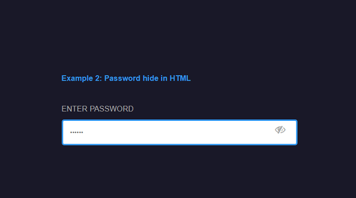
<h4> Example 2: Password hide in HTML </h4>
<form class="form-2" action="">
<lable> Enter password
<input class="input-2" type="password" placeholder="??????">
</lable>
</form>
</div>
</body>
</html> Output:
The output of this example is given below: