This article will understand the working of the HTML5 accept attribute.
What do you mean by accepting attributes in HTML5?
In HTML, accept attribute specifies a filter for what file types the user can pick from the file input dialog box. This attribute can only be used with <input type=”file”>. It allows a browsers to only show files that are allowed for the current input.
Syntax:
<input accept="file_extension|audio/*|video/*|image/*"> In the above syntax, we can either pass an extension of the file or a type of file you want to select from a file upload option such as image, audio, video, etc.
Following are the various examples of HTML 5 accept attributes.
Example 1:
<! DOCTYPE html>
<html>
<head>
<meta charset = "utf-8">
<meta name = "viewport" content = "width=device-width, initial-scale = 1.0">
<title> HTML5 accept attribute </title>
<link rel = "stylesheet" href = "https://codepen.io/gymratpacks/pen/VKzBEp#0">
<link href = 'https://fonts.googleapis.com/css?family=Nunito:400,300' rel = 'stylesheet' type = 'text/css'>
<style>
@import url(https://fonts.googleapis.com/css?family=Roboto:400,300);
* { box-sizing: border-box; }
html { height: 100%; }
body {
color: #000;
height: 100vh;
background-color: #FBAB7E;
background-image: linear-gradient(62deg, #FBAB7E 0%, #F7CE68 100%);
}
h1 {
position: relative;
padding: 0;
margin: 0;
font-family: "Raleway", sans-serif;
font-weight: 300;
font-size: 40px;
color: #080808;
-webkit-transition: all 0.4s ease 0s;
-o-transition: all 0.4s ease 0s;
transition: all 0.4s ease 0s;
text-align: center;
}
form {
position: absolute;
top: 20;
left: 50%;
width: 500px;
transform: translateX(-50%);
margin: 2rem 1;
z-index: 1;
}
fieldset {
margin: 0 0 1rem 0;
padding: 0;
border: none;
}
legend {
font-weight: bold;
}
Legend {
display: inline-block;
margin-bottom: .5rem;
font-weight: bold;
}
label {
display: inline-block;
margin-bottom: .5rem;
font-weight: bold;
}
input[type='text'] {
display: block;
padding: .5rem;
width: 100%;
background-color: white;
border-radius: .35rem;
border: 1px solid #e5e5e5;
outline: none;
transition-property: none;
transition-duration: none;
&:focus {
border-color: rgb(239,126,173);
}
}
textarea {
display: block;
padding: .5rem;
width: 100%;
background-color: white;
border-radius: .25rem;
border: 1px solid #e5e5e5;
outline: none;
transition-property: none;
transition-duration: none;
&:focus {
border-color: rgb(239,126,173);
}
}
select {
display: block;
padding: .5rem;
width: 100%;
background-color: white;
border-radius: .25rem;
border: 1px solid #e5e5e5;
outline: none;
transition-property: none;
transition-duration: none;
&:focus {
border-color: rgb(239,126,173);
}
}
textarea {
max-width: 500px;
height: 100px;
}
input[type='text'] {
height: 34px;
}
select {
font-size: .875rem;
height: 34px;
}
input[type='checkbox'] {
position: relative;
top: 5px;
width: 24px;
height: 22px;
margin: 0 .5rem;
background-color: white;
border: 1px solid #e5e5e5;
outline: none;
-moz-appearance: none;
-webkit-appearance: none;
transition-property: none;
transition-duration: none;
}
input[type='radio'] {
position: relative;
top: 5px;
width: 24px;
height: 22px;
margin: 0 .6rem;
background-color: white;
border: 1px solid #e5e5e5;
outline: none;
-moz-appearance: none;
-webkit-appearance: none;
transition-property: none;
transition-duration: none;
}
input[type='checkbox'] {
border-radius: 5px;
&:checked {
background-color: rgb(239,126,173);
border: none;
&:after {
display: block;
content: ' ';
height: 4px;
width: 10px;
border-bottom: 3px solid #fff;
border-left: 3px solid #fff;
transform: translate(5px,6px) rotate(-45deg) scale(1);
}
}
}
input[type='radio'] {
border-radius: 50%;
&:checked {
border-width: 5px;
border-color: white;
background-color: rgb(239,126,173);
}
}
button {
display: block;
margin: 1em auto;
padding: .5rem 2rem;
font-size: 125%;
color: white;
border: none;
border-radius: .25rem;
background-color: rgb(92 34 8);
outline: none;
box-shadow: 0 .4rem .1rem -.3rem rgba(0,0,0,.1);
transform: perspective(300px) scale(.95) translateZ(0);
transform-style: preserve-3d;
transition-property: none;
transition-duration: none;
&:hover {
cursor: pointer;
background-color: rgb(255,150,200);
box-shadow: 0 0 0 0 rgba(0,0,0,0);
transform: scale(1.1) rotateX(0);
}
&:active {
background-color: rgb(239,126,173);
transform: scale(1.05) rotateX(-10deg);
}
}
</style>
<h1> HTML5 accept attribute Example </h1>
<form>
<fieldset>
<label for = "firstName"> Full Name </label>
<input type = "text" name = "name" id = "firstName" spellcheck = "true" placeholder = "First Name">
</fieldset>
<fieldset>
<legend> Qualification </legend>
<input type = "checkbox" id = "check1" name = "checkboxes" checked>
<label for = "check1"> BCA </label> <br>
<input type = "checkbox" id = "check2" name = "checkboxes">
<label for = "check2"> MCA </label> <br>
<input type = "checkbox" id = "check2" name = "checkboxes">
<label for = "check2"> BA </label> <br>
<input type = "checkbox" id = "check2" name = "checkboxes">
<label for = "check2"> MSC IT </label> <br>
</fieldset>
<fieldset>
<legend> Gender </legend>
<input type = "radio" id = "radio1" name = "radios" checked>
<label for = "radio1"> Male </label> <br>
<input type = "radio" id = "radio2" name = "radios">
<label for = "radio2"> Female </label> <br>
<input type = "radio" id = "radio2" name = "radios">
<label for = "radio2"> Transgender </label> <br>
</fieldset>
<fieldset>
<label for="select-choice"> Select Hobbies </label>
<select name = "select-choice" id = "select-choice">
<option value = "Choice 1"> - - select one - - </option>
<option value = "Choice 2"> Dancing </option>
<option value = "Choice 2"> Singing </option>
<option value = "Choice 2"> Playing </option>
<option value = "Choice 2"> Cooking </option>
</select>
</fieldset>
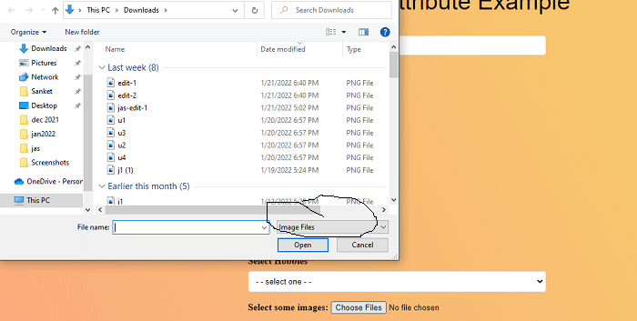
<p>
<label for = "imageFile"> Select some images: </label>
<input type = "file" id = "imageFile" accept = "image/*" multiple>
</p>
<button> Submit </button>
</form>
</body>
</html> Explanation:
In the above example, we have created an example of the accept attribute. In this, we have uploaded only the image from the file input box.
<input type = "file" id = "imageFile" accept = "image/*" multiple> In this
- <input> tag is used to get the input from the user
- type=”file” used to specifies the file input.
- accept parameter is used to specifies that the server accepted file types.
- “image/*” is define the input file must be image format.
- multiple attribute means we can upload multiple image files from the input dialog box.
Output:
Following is the output of this example.
Example 2:
<! DOCTYPE html>
<html>
<head>
<meta charset = "utf-8">
<meta name = "viewport" content = "width=device-width, initial-scale = 1.0">
<title> HTML5 accept attribute </title>
<link rel = "stylesheet" href = "https://codepen.io/gymratpacks/pen/VKzBEp#0">
<link href = 'https://fonts.googleapis.com/css?family=Nunito:400,300' rel = 'stylesheet' type = 'text/css'>
<style>
@import url(https://fonts.googleapis.com/css?family=Roboto:400,300);
* { box-sizing: border-box; }
html { height: 100%; }
body {
color: #000;
height: 100vh;
background-color: #FBAB7E;
background-image: linear-gradient(62deg, #FBAB7E 0%, #F7CE68 100%);
}
h1 {
position: relative;
padding: 0;
margin: 0;
font-family: "Raleway", sans-serif;
font-weight: 300;
font-size: 40px;
color: #080808;
-webkit-transition: all 0.6s ease 0s;
-o-transition: all 0.6s ease 0s;
transition: all 0.6s ease 0s;
text-align: center;
}
form {
position: absolute;
top: 40;
left: 50%;
width: 510px;
transform: translateX(-50%);
margin: 2rem 1;
z-index: 1;
}
fieldset {
margin: 0 0 1rem 0;
padding: 1;
border: none;
}
legend {
font-weight: bold;
}
label {
display: inline-block;
margin-bottom: .5rem;
font-weight: bold;
}
input[type='text'] {
display: block;
padding: .5rem;
width: 100%;
background-color: white;
border-radius: .25rem;
border: 1px solid #e5e5e5;
outline: none;
transition-property: none;
transition-duration: none;
&:focus {
border-color: rgb(239,126,173);
}
}
Legend {
display: inline-block;
margin-bottom: .5rem;
font-weight: bold;
}
textarea {
display: block;
padding: .5rem;
width: 100%;
background-color: white;
border-radius: .25rem;
border: 1px solid #e5e5e5;
outline: none;
transition-property: none;
transition-duration: none;
&:focus {
border-color: rgb(239,126,173);
}
}
select {
display: block;
padding: .5rem;
width: 100%;
background-color: white;
border-radius: .25rem;
border: 1px solid #e5e5e5;
outline: none;
transition-property: none;
transition-duration: none;
&:focus {
border-color: rgb(239,126,173);
}
}
textarea {
max-width: 500px;
height: 100px;
}
input[type='text'] {
height: 34px;
}
select {
font-size: .875rem;
height: 34px;
}
input[type='checkbox'] {
position: relative;
top: 5px;
width: 22px;
height: 22px;
margin: 0 .5rem;
background-color: white;
border: 1px solid #e5e5e5;
outline: none;
-moz-appearance: none;
-webkit-appearance: none;
transition-property: none;
transition-duration: none;
}
input[type='radio'] {
position: relative;
top: 5px;
width: 22px;
height: 22px;
margin: 0 .5rem;
background-color: white;
border: 1px solid #e5e5e5;
outline: none;
-moz-appearance: none;
-webkit-appearance: none;
transition-property: none;
transition-duration: none;
}
input[type='checkbox'] {
border-radius: 5px;
&:checked {
background-color: rgb(239,126,173);
border: none;
&:after {
display: block;
content: ' ';
height: 4px;
width: 10px;
border-bottom: 3px solid #fff;
border-left: 3px solid #fff;
transform: translate(5px,6px) rotate(-45deg) scale(1);
}
}
}
input[type='radio'] {
border-radius: 50%;
&:checked {
border-width: 5px;
border-color: white;
background-color: rgb(239,126,173);
}
}
button {
display: block;
margin: 1em auto;
padding: .5rem 2rem;
font-size: 125%;
color: white;
border: none;
border-radius: .35rem;
background-color: rgb(92 34 8);
outline: none;
box-shadow: 0 .4rem .1rem -.3rem rgba(0,0,0,.1);
transform: perspective(300px) scale(.95) translateZ(0);
transform-style: preserve-3d;
transition-property: none;
transition-duration: none;
&:hover {
cursor: pointer;
background-color: rgb(255,150,200);
box-shadow: 0 0 0 0 rgba(0,0,0,0);
transform: scale(1.1) rotateX(0);
}
&:active {
background-color: rgb(239,126,173);
transform: scale(1.05) rotateX(-10deg);
}
}
</style>
<h1> HTML5 accept attribute Example </h1>
<form>
<fieldset>
<label for = "firstName"> Full Name </label>
<input type = "text" name = "name" id = "firstName" spellcheck = "true" placeholder = "First Name">
</fieldset>
<fieldset>
<legend> Qualification </legend>
<input type = "checkbox" id = "check1" name = "checkboxes" checked>
<label for = "check1"> BCA </label> <br>
<input type = "checkbox" id = "check2" name = "checkboxes">
<label for = "check2"> MCA </label> <br>
<input type = "checkbox" id = "check2" name = "checkboxes">
<label for = "check2"> BA </label> <br>
<input type = "checkbox" id = "check2" name = "checkboxes">
<label for = "check2"> MSC IT </label> <br>
</fieldset>
<fieldset>
<legend> Gender </legend>
<input type = "radio" id = "radio1" name = "radios" checked>
<label for = "radio1"> Male </label> <br>
<input type = "radio" id = "radio2" name = "radios">
<label for = "radio2"> Female </label> <br>
<input type = "radio" id = "radio2" name = "radios">
<label for = "radio2"> Transgender </label> <br>
</fieldset>
<fieldset>
<label for="select-choice"> Select Hobbies </label>
<select name = "select-choice" id = "select-choice">
<option value = "Choice 1"> - - select one - - </option>
<option value = "Choice 2"> Dancing </option>
<option value = "Choice 2"> Singing </option>
<option value = "Choice 2"> Playing </option>
<option value = "Choice 2"> Cooking </option>
</select>
</fieldset>
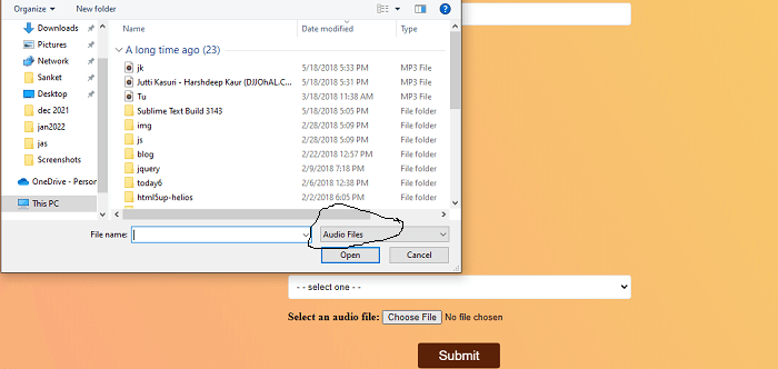
<p>
<label for = "soundFile"> Select an audio file: </label>
<input type = "file" id = "soundFile" accept = "audio/*">
</p>
<button> Submit </button>
</form>
</body>
</html> Explanation:
In the above example, we have created an example of the accept attribute. In this, we have uploaded only the audio from the file input box.
<input type = "file" id = "soundFile" accept = "audio/*"> In this
- <input> tag is used to get the input from the user
- type=”file” used to specifies the file input.
- accept parameter is used to specifies that the server accepted file types.
- “audio/*” is define the input file must be audio format.
Output:
Following is the output of this example.
Example 3:
<! DOCTYPE html>
<html>
<head>
<meta charset = "utf-8">
<meta name = "viewport" content = "width=device-width, initial-scale = 1.0">
<title> HTML5 accept attribute </title>
<link rel = "stylesheet" href = "https://codepen.io/gymratpacks/pen/VKzBEp#0">
<link href = 'https://fonts.googleapis.com/css?family=Nunito:400,300' rel = 'stylesheet' type = 'text/css'>
<style>
@import url(https://fonts.googleapis.com/css?family=Roboto:400,300);
* { box-sizing: border-box; }
html { height: 100%; }
body {
color: #000;
height: 100vh;
background-color: #FBAB7E;
background-image: linear-gradient(62deg, #FBAB7E 0%, #F7CE68 100%);
}
h1 {
position: relative;
padding: 0;
margin: 0;
font-family: "Raleway", sans-serif;
font-weight: 300;
font-size: 40px;
color: #080808;
-webkit-transition: all 0.4s ease 0s;
-o-transition: all 0.4s ease 0s;
transition: all 0.4s ease 0s;
text-align: center;
}
form {
position: absolute;
top: 30;
left: 50%;
width: 500px;
transform: translateX(-50%);
margin: 2rem 0;
z-index: 1;
}
fieldset {
margin: 0 1 1rem 0;
padding: 1;
border: none;
}
legend {
font-weight: bold;
}
Legend {
display: inline-block;
margin-bottom: .5rem;
font-weight: bold;
}
input[type='text'] {
display: block;
padding: .5rem;
width: 100%;
background-color: white;
border-radius: .25rem;
border: 1px solid #e5e5e5;
outline: none;
transition-property: none;
transition-duration: none;
&:focus {
border-color: rgb(239,126,173);
}
}
label {
display: inline-block;
margin-bottom: .5rem;
font-weight: bold;
}
textarea {
display: block;
padding: .5rem;
width: 100%;
background-color: white;
border: 1px solid #e5e5e5;
outline: none;
transition-property: none;
border-radius: .25rem;
transition-duration: none;
&:focus {
border-color: rgb(259,126,173);
}
}
select {
display: block;
padding: .8rem;
width: 100%;
outline: none;
background-color: white;
border-radius: .25rem;
border: 1px solid #e5e5e5;
transition-property: none;
transition-duration: none;
&:focus {
border-color: rgb(239,126,173);
}
}
textarea {
max-width: 500px;
height: 100px;
}
input[type='text'] {
height: 34px;
}
input[type='checkbox'] {
position: relative;
top: 6px;
width: 22px;
height: 23px;
margin: 0 .5rem;
background-color: white;
border: 1px solid #e5e5e5;
outline: none;
-moz-appearance: none;
-webkit-appearance: none;
transition-property: none;
transition-duration: none;
}
select {
font-size: .885rem;
height: 34px;
}
input[type='radio'] {
position: relative;
top: 5px;
width: 22px;
height: 23px;
margin: 0 .5rem;
background-color: white;
border: 1px solid #e5e5e5;
outline: none;
-moz-appearance: none;
-webkit-appearance: none;
transition-property: none;
transition-duration: none;
}
input[type='checkbox'] {
border-radius: 5px;
&:checked {
background-color: rgb(239,126,173);
border: none;
&:after {
display: block;
content: ' ';
height: 4px;
transform: translate(5px,6px) rotate(-45deg) scale(1);
width: 12px;
border-bottom: 3px solid #fff;
border-left: 3px solid #fff;
}
}
}
input[type='radio'] {
border-radius: 51%;
&:checked {
background-color: rgb(239,126,173);
border-width: 6px;
border-color: white;
}
}
button {
display: block;
margin: 1em auto;
padding: .5rem 2rem;
font-size: 125%;
color: white;
border: none;
border-radius: .25rem;
background-color: rgb(92 34 8);
outline: none;
box-shadow: 0 .4rem .1rem -.3rem rgba(0,0,0,.1);
transform: perspective(300px) scale(.95) translateZ(0);
transform-style: preserve-3d;
transition-property: none;
transition-duration: none;
&:hover {
cursor: pointer;
background-color: rgb(255,150,200);
box-shadow: 0 0 0 0 rgba(0,0,0,0);
transform: scale(1.1) rotateX(0);
}
&:active {
background-color: rgb(239,126,173);
transform: scale(1.05) rotateX(-10deg);
}
}
</style>
<h1> HTML5 accept attribute Example </h1>
<form>
<fieldset>
<label for = "firstName"> Full Name </label>
<input type = "text" name = "name" id = "firstName" spellcheck = "true" placeholder = "First Name">
</fieldset>
<fieldset>
<legend> Qualification </legend>
<input type = "checkbox" id = "check1" name = "checkboxes" checked>
<label for = "check1"> BCA </label> <br>
<input type = "checkbox" id = "check2" name = "checkboxes">
<label for = "check2"> MCA </label> <br>
<input type = "checkbox" id = "check2" name = "checkboxes">
<label for = "check2"> BA </label> <br>
<input type = "checkbox" id = "check2" name = "checkboxes">
<label for = "check2"> MSC IT </label> <br>
</fieldset>
<fieldset>
<legend> Gender </legend>
<input type = "radio" id = "radio1" name = "radios" checked>
<label for = "radio1"> Male </label> <br>
<input type = "radio" id = "radio2" name = "radios">
<label for = "radio2"> Female </label> <br>
<input type = "radio" id = "radio2" name = "radios">
<label for = "radio2"> Transgender </label> <br>
</fieldset>
<fieldset>
<label for="select-choice"> Select Hobbies </label>
<select name = "select-choice" id = "select-choice">
<option value = "Choice 1"> - - select one - - </option>
<option value = "Choice 2"> Dancing </option>
<option value = "Choice 2"> Singing </option>
<option value = "Choice 2"> Playing </option>
<option value = "Choice 2"> Cooking </option>
</select>
</fieldset>
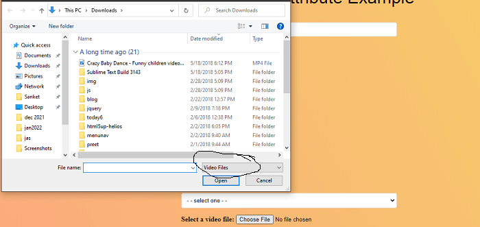
<p>
<label for = "videoFile"> Select a video file: </label>
<input type = "file" id = "videoFile" accept = "video/*">
</p>
<button> Submit </button>
</form>
</body>
</html> Explanation:
In the above example, we have created an example of the accept attribute. In this, we have uploaded only the video from the file input box.
<input type = "file" id = "videoFile" accept = "video/*"> In this
- <input> tag is used to get the input from the user
- type=”file” used to specifies the file input.
- accept parameter is used to specifies that the server accepted file types.
- “video/*” is define the input file must be video format.
Output:
Following is the output of this example.