CSS align-self property aligns the selected items inside the current flex line and override the align-items values.
The align-self property is one of the CSS3 properties.
The align-self property accepts the same values as the align-items property:
- auto
- stretch
- flex-start
- flex-end
- center
- baseline
| Initial Value | auto |
| Applies to | Flex items, grid items, and absolutely-positioned boxes. |
| Inherited | No. |
| Animatable | No. |
| Version | CSS3 |
| DOM Syntax | object.style.alignSelf = “auto”; |
Syntax
align-self: auto | stretch | center | flex-start | flex-end | baseline | initial | inherit;Example of the align-self property:
<!DOCTYPE html>
<html>
<head>
<title>The title of the document</title>
<style>
section {
display: flex;
align-items: center;
height: 120px;
padding: 10px;
background: #99caff;
}
div {
height: 60px;
background: #1c87c9;
margin: 5px;
}
div:nth-child(1) {
align-self: flex-start;
background: #8ebf42;
}
</style>
</head>
<body>
<h2>Align-self property example</h2>
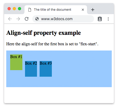
<p>Here the align-self for the first box is set to "flex-start".</p>
<section>
<div>Box #1</div>
<div>Box #2</div>
<div>Box #3</div>
</section>
</body>
</html>Result
Here is an example where three boxes are used and the second is specified by “flex-end” value.
Example of the align-self property with the “flex-end” value:
<!DOCTYPE html>
<html>
  <head>
    <title>The title of the document</title>
    <style>
      section {
        display: flex;
        align-items: center;
        height: 120px;
        padding: 10px;
        background: #99caff;
      }
      div {
        height: 60px;
        background: #1c87c9;
        margin: 5px;
      }
      div:nth-child(2) {
        align-self: flex-end;
        background: #8ebf42;
      }
    </style>
  </head>
  <body>
    <h2>Align-self property example</h2>
    <p>Here the align-self for the second box is set to "flex-end".</p>
    <section>
      <div>Box #1</div>
      <div>Box #2</div>
      <div>Box #3</div>
    </section>
  </body>
</html>