In this tutorial you will learn how to create alerts messages with Bootstrap.
Creating Alert Messages with Bootstrap
Alert boxes are used quite often to stand out the information that requires immediate attention of the end users such as warning, error or confirmation messages.
With Bootstrap you can easily create elegant alert messages for various purposes by adding the contextual classes (e.g., .alert-success, .alert-warning, .alert-info etc.) to the .alert base class. You can also add an optional close button to dismiss any alert.
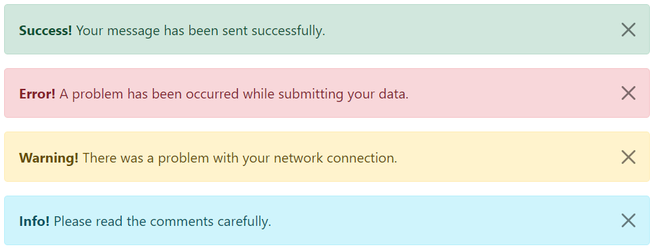
Bootstrap provides total 8 different types of alerts. The following example will show you the most commonly used alerts, which are: success, error or danger, warning and info alerts.
Example
<!-- Success Alert -->
<div class="alert alert-success alert-dismissible fade show">
    <strong>Success!</strong> Your message has been sent successfully.
    <button type="button" class="btn-close" data-bs-dismiss="alert"></button>
</div>

<!-- Error Alert -->
<div class="alert alert-danger alert-dismissible fade show">
    <strong>Error!</strong> A problem has been occurred while submitting your data.
    <button type="button" class="btn-close" data-bs-dismiss="alert"></button>
</div>

<!-- Warning Alert -->
<div class="alert alert-warning alert-dismissible fade show">
    <strong>Warning!</strong> There was a problem with your network connection.
    <button type="button" class="btn-close" data-bs-dismiss="alert"></button>
</div>

<!-- Info Alert -->
<div class="alert alert-info alert-dismissible fade show">
    <strong>Info!</strong> Please read the comments carefully.
    <button type="button" class="btn-close" data-bs-dismiss="alert"></button>
</div>
— The output of the above example will look something like this:
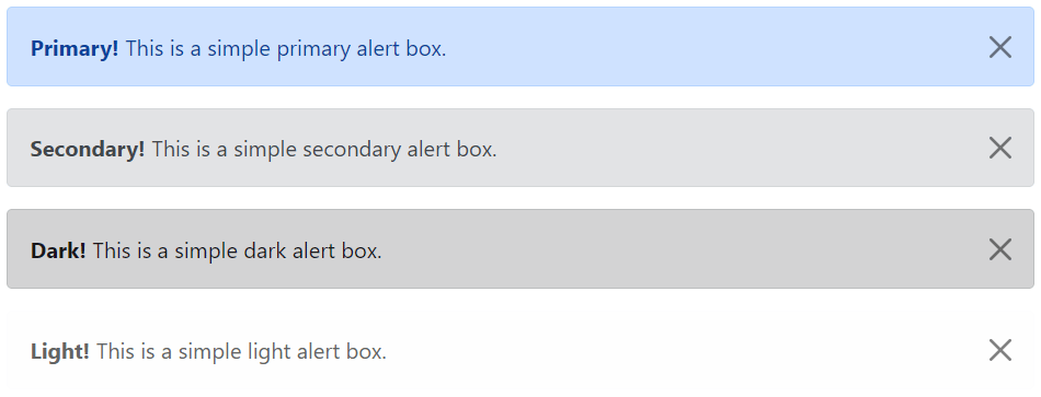
Here’re the remaining four Bootstrap alerts that can be used for various purposes.
Example
<!-- Primary Alert -->
<div class="alert alert-primary alert-dismissible fade show">
    <strong>Primary!</strong> This is a simple primary alert box.
    <button type="button" class="btn-close" data-bs-dismiss="alert"></button>
</div>

<!-- Secondary Alert -->
<div class="alert alert-secondary alert-dismissible fade show">
    <strong>Secondary!</strong> This is a simple secondary alert box.
    <button type="button" class="btn-close" data-bs-dismiss="alert"></button>
</div>

<!-- Dark Alert -->
<div class="alert alert-dark alert-dismissible fade show">
    <strong>Dark!</strong> This is a simple dark alert box.
    <button type="button" class="btn-close" data-bs-dismiss="alert"></button>
</div>

<!-- Light Alert -->
<div class="alert alert-light alert-dismissible fade show">
    <strong>Light!</strong> This is a simple light alert box.
    <button type="button" class="btn-close" data-bs-dismiss="alert"></button>
</div>
— The output of the above example will look something like this:
Tip: The .fade and .show classes on the .alert element enable the fading transition effect while closing the alert boxes. If you don’t want animation just removes these classes. Also, the class .alert-dismissible is required on the .alert element for proper positioning of the .btn-close. If your alert doesn’t have a close button you can skip this class.