You can also add captions to carousel slides easily with the .carousel-caption element within any .carousel-item. You can optionally use display utility classes to hide captions on smaller viewports.
Let’s try out the following example to understand how it basically works:
Example
<div id="myCarousel" class="carousel slide" data-bs-ride="carousel">
    <!-- Carousel indicators -->
    <ol class="carousel-indicators">
        <li data-bs-target="#myCarousel" data-bs-slide-to="0" class="active"></li>
        <li data-bs-target="#myCarousel" data-bs-slide-to="1"></li>
        <li data-bs-target="#myCarousel" data-bs-slide-to="2"></li>
    </ol>

    <!-- Wrapper for carousel items -->
    <div class="carousel-inner">
        <div class="carousel-item active">
            <img src="images/slide1.png" class="d-block w-100" alt="Slide 1">
            <div class="carousel-caption d-none d-md-block">
                <h5>First slide label</h5>
                <p>Some placeholder content for the first slide.</p>
            </div>
        </div>
        <div class="carousel-item">
            <img src="images/slide2.png" class="d-block w-100" alt="Slide 2">
            <div class="carousel-caption d-none d-md-block">
                <h5>Second slide label</h5>
                <p>Some placeholder content for the second slide.</p>
            </div>
        </div>
        <div class="carousel-item">
            <img src="images/slide3.png" class="d-block w-100" alt="Slide 3">
            <div class="carousel-caption d-none d-md-block">
                <h5>Third slide label</h5>
                <p>Some placeholder content for the third slide.</p>
            </div>
        </div>
    </div>

    <!-- Carousel controls -->
    <a class="carousel-control-prev" href="#myCarousel" data-bs-slide="prev">
        <span class="carousel-control-prev-icon"></span>
    </a>
    <a class="carousel-control-next" href="#myCarousel" data-bs-slide="next">
        <span class="carousel-control-next-icon"></span>
    </a>
</div>
— The output of the above example will look something like this:
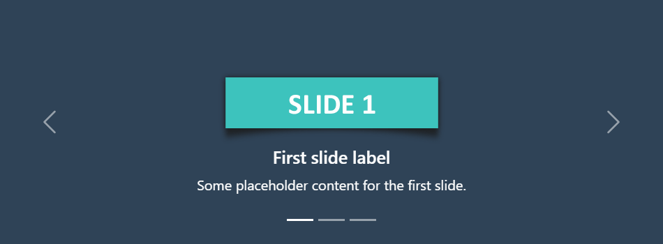
Tip: The classes .d-none and .d-md-block on the .carousel-caption elements in the example above makes the carousel captions visible on the medium devices (i.e. viewport width ≥768px), but hide them on the smaller viewports.
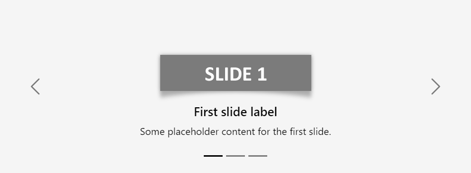
Creating Dark Variant of Carousel
You can additionally add .carousel-dark to the .carousel to create darker controls, indicators, and captions in case your slides are lighter in color. Let’s check out an example:
Example
<div id="myCarousel" class="carousel carousel-dark slide" data-bs-ride="carousel">
    <!-- Carousel indicators -->
    <ol class="carousel-indicators">
        <li data-bs-target="#myCarousel" data-bs-slide-to="0" class="active"></li>
        <li data-bs-target="#myCarousel" data-bs-slide-to="1"></li>
        <li data-bs-target="#myCarousel" data-bs-slide-to="2"></li>
    </ol>

    <!-- Wrapper for carousel items -->
    <div class="carousel-inner">
        <div class="carousel-item active">
            <img src="images/slide1-light.png" class="d-block w-100" alt="Slide 1">
        </div>
        <div class="carousel-item">
            <img src="images/slide2-light.png" class="d-block w-100" alt="Slide 2">
        </div>
        <div class="carousel-item">
            <img src="images/slide3-light.png" class="d-block w-100" alt="Slide 3">
        </div>
    </div>

    <!-- Carousel controls -->
    <a class="carousel-control-prev" href="#myCarousel" data-bs-slide="prev">
        <span class="carousel-control-prev-icon"></span>
    </a>
    <a class="carousel-control-next" href="#myCarousel" data-bs-slide="next">
        <span class="carousel-control-next-icon"></span>
    </a>
</div>
— The output of the above example will look something like this:
You can also add captions such as heading or description text to the individual slides of the carousel, please check out the next example in the following section.
Activate Carousels via Data Attributes
With Bootstrap you can create carousels very easily via data attributes without writing a single line of JavaScript code. Let’s take a look at the following example:
Example
<div id="myCarousel" class="carousel slide" data-bs-ride="carousel">
    <!-- Carousel indicators -->
    <ol class="carousel-indicators">
        <li data-bs-target="#myCarousel" data-bs-slide-to="0" class="active"></li>
        <li data-bs-target="#myCarousel" data-bs-slide-to="1"></li>
        <li data-bs-target="#myCarousel" data-bs-slide-to="2"></li>
    </ol>

    <!-- Wrapper for carousel items -->
    <div class="carousel-inner">
        <div class="carousel-item active">
            <img src="images/slide1.png" class="d-block w-100" alt="Slide 1">
        </div>
        <div class="carousel-item">
            <img src="images/slide2.png" class="d-block w-100" alt="Slide 2">
        </div>
        <div class="carousel-item">
            <img src="images/slide3.png" class="d-block w-100" alt="Slide 3">
        </div>
    </div>

    <!-- Carousel controls -->
    <a class="carousel-control-prev" href="#myCarousel" data-bs-slide="prev">
        <span class="carousel-control-prev-icon"></span>
    </a>
    <a class="carousel-control-next" href="#myCarousel" data-bs-slide="next">
        <span class="carousel-control-next-icon"></span>
    </a>
</div>
You might be wondering what this code was all about. Well, let’s go through each part of this carousel example code one by one for a better understanding.
Explanation of Code
The Bootstrap carousel generally has three components — carousel indicators (small rectangles), carousel controls (previous and next arrows) and the carousel items or slides.
- The outermost container of every carousel (i.e. the
.carouselelement) requires a uniqueid(in our caseid="myCarousel") so that it can be targeted by the carousel indicators (line no-4,5,6) and carousel controls (line no-23,26) to function properly. - The
data-bs-ride="carousel"attribute of the.carouselelement tells the Bootstrap to start animating the carousel immediately when the page load. - The
data-bs-slide-toattribute (line no-4,5,6) move the slide position to a particular item (index beginning with 0) when clicking on the specific carousel indicator. - The slides are specified within the
.carousel-inner(line no-10) and the content of each slide is defined within the.carousel-itemelement that can be text and images. - The
data-bs-slideattribute on carousel controls (line no-23,26) accepts the keywordsprevornext, which alters the slide position relative to its current position.
Rest of the thing is self-explanatory, for example, the .carousel element specifies the Bootstrap carousel, the .carousel-indicators element indicates how many slides are there in the carousel and which slide is currently active, .carousel-control-prev, .carousel-control-next elements defines previous and next controls to move between carousel slides, and so on.
Tip: It is required to add the class .active to one of the carousel slides (i.e. on the .carousel-item element), otherwise carousel will not be visible.
Note: The .slide class on the .carousel element adds CSS slide transition animation to the carousel that makes the carousel items slide when showing the new item.