The filter property is used to apply visual effects to an element (image). The filter property has the following values:
- none
- blur
- brightness
- contrast
- drop-shadow
- grayscale
- hue-rotate
- invert
- opacity
- saturate
- sepia
- url
| Initial Value | none |
| Applies to | Table-cell elements. |
| Inherited | No. |
| Animatable | Yes. |
| Version | CSS3 |
| DOM Syntax | object.style.WebkitFilter = “hue-rotate(360deg)”; |
Syntax
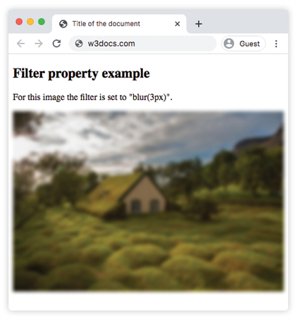
filter: none | blur() | brightness() | contrast() | drop-shadow() | grayscale() | hue-rotate() | invert() | opacity() | saturate() | sepia() | url() | initial | inherit;Example of the filter property:
<!DOCTYPE html>
<html>
  <head>
    <title>Title of the document</title>
    <style>
      img {
        -webkit-filter: blur(3px); /* Safari 6.0 - 9.0 */
        filter: blur(3px);
        max-width: 100%;
      }
    </style>
  </head>
  <body>
    <h2>Filter property example</h2>
    <p>For this image the filter is set to "blur(3px)".</p>
    <p>
      <img src="/uploads/media/default/0001/01/4982c4f43023330a662b9baed5a407e391ae6161.jpeg" alt="Background Image">
    </p>
  </body>
</html>
Result
Example of using the filter property to make the image brighter:
<!DOCTYPE html>
<html>
  <head>
    <title>Title of the document</title>
    <style>
      img {
        -webkit-filter: brightness(150%); /* Safari 6.0 - 9.0 */
        filter: brightness(150%);
        max-width: 100%;
      }
    </style>
  </head>
  <body>
    <h2>Filter property example</h2>
    <p>For this image the filter is set to "brightness(150%)".</p>
    <p>
      <img src="/uploads/media/default/0001/01/4982c4f43023330a662b9baed5a407e391ae6161.jpeg" alt="Background Image">
    </p>
  </body>
</html>
In the following examples “greyscale” value makes the image gray:
Example of the filter property with the “greyscale” value:
<!DOCTYPE html>
<html>
  <head>
    <title>Title of the document</title>
    <style>
      img {
        -webkit-filter: grayscale(80%); /* Safari 6.0 - 9.0 */
        filter: grayscale(80%);
        max-width: 100%;
      }
    </style>
  </head>
  <body>
    <h2>Filter example</h2>
    <p>For this image the filter is set to "grayscale(80%)".</p>
    <p>
      <img src="/uploads/media/default/0001/01/4982c4f43023330a662b9baed5a407e391ae6161.jpeg" alt="Background Image">
    </p>
  </body>
</html>
Here, “saturate” filter is applied to the image where the given value is 300%.
Example of the filter property with the “saturate” value:
<!DOCTYPE html>
<html>
  <head>
    <title>Title of the document</title>
    <style>
      img {
        -webkit-filter: saturate(300%); /* Safari 6.0 - 9.0 */
        filter: saturate(300%);
        max-width: 100%;
      }
    </style>
  </head>
  <body>
    <h2>Filter example</h2>
    <p>For this image the filter is set to "saturate(300%)".</p>
    <p>
      <img src="/uploads/media/default/0001/01/4982c4f43023330a662b9baed5a407e391ae6161.jpeg" alt="Background Image">
    </p>
  </body>
</html>
Example of the filter property with the “sepia” value:
<!DOCTYPE html>
<html>
  <head>
    <title>Title of the document</title>
    <style>
      img {
        -webkit-filter: sepia(70%); /* Safari 6.0 - 9.0 */
        filter: sepia(70%);
        max-width: 100%;
      }
    </style>
  </head>
  <body>
    <h2>Filter example</h2>
    <p>For this image the filter is set to "sepia(70%)".</p>
    <p>
      <img src="/uploads/media/default/0001/01/4982c4f43023330a662b9baed5a407e391ae6161.jpeg" alt="Background Image">
    </p>
  </body>
</html>
Example of the filter property with the “contrast” value:
<!DOCTYPE html>
<html>
  <head>
    <title>Title of the document</title>
    <style>
      img {
        -webkit-filter: contrast(40%); /* Safari 6.0 - 9.0 */
        filter: contrast(40%);
        max-width: 100%;
      }
    </style>
  </head>
  <body>
    <h2>Filter example</h2>
    <p>For this image the filter is set to "contrast(40%)".</p>
    <p>
      <img src="/uploads/media/default/0001/01/4982c4f43023330a662b9baed5a407e391ae6161.jpeg" alt="Background Image">
    </p>
  </body>
</html>
Example of the filter property with the “opacity” value:
<!DOCTYPE html>
<html>
  <head>
    <title>Title of the document</title>
    <style>
      img {
        -webkit-filter: opacity(0.4);  /* Safari 6.0 - 9.0 */
        filter: opacity(0.4);
        max-width: 100%;
      }
    </style>
  </head>
  <body>
    <h2>Filter example</h2>
    <p>For this image the filter is set to "opacity(0.4)".</p>
    <p>
      <img src="/uploads/media/default/0001/01/4982c4f43023330a662b9baed5a407e391ae6161.jpeg" alt="Background Image">
    </p>
  </body>
</html>
Example of the filter property with the “invert” value:
<!DOCTYPE html>
<html>
  <head>
    <title>Title of the document</title>
    <style>
      img {
        -webkit-filter: invert(0.7); /* Safari 6.0 - 9.0 */
        filter: invert(0.7);
        max-width: 100%;
      }
    </style>
  </head>
  <body>
    <h2>Filter example</h2>
    <p>For this image the filter is set to "invert(0.7)".</p>
    <p>
      <img src="/uploads/media/default/0001/01/4982c4f43023330a662b9baed5a407e391ae6161.jpeg" alt="Background Image">
    </p>
  </body>
</html>
Example of the filter property with the “hue-rotate” value:
<!DOCTYPE html>
<html>
  <head>
    <title>Title of the document</title>
    <style>
      img {
        -webkit-filter: hue-rotate(90deg); /* Safari 6.0 - 9.0 */
        filter: hue-rotate(90deg);
        max-width: 100%;
      }
    </style>
  </head>
  <body>
    <h2>Filter example</h2>
    <p>For this image the filter is set to "hue-rotate(90deg)".</p>
    <p>
      <img src="/uploads/media/default/0001/01/4982c4f43023330a662b9baed5a407e391ae6161.jpeg" alt="Background Image">
    </p>
  </body>
</html>