The grid-row-end property is used to specify on which row to stop displaying the item or how many rows the item will span.
The width and height of the items in the container should not be initialized directly. When they are initialized, we can’t see the span effect.
| Initial Value | auto |
| Applies to | Grid items. |
| Inherited | No. |
| Animatable | Yes. |
| Version | CSS Grid Layout Module Level 1 |
| DOM Syntax | object.style.gridRowEnd = “4”; |
Syntax
grid-row-end: auto | row-line | span n | inherit | initial | unset;Example of the grid-row-end property:
<!DOCTYPE html>
<html>
  <head>
    <title>Title of the document</title>
    <style>
      .grid-container {
        display: grid;
        grid-template-columns: auto auto auto;
        grid-gap: 10px;
        background-color: #666;
        padding: 10px;
      }
      .grid-container > div {
        background-color: #eee;
        text-align: center;
        padding: 20px 0;
        font-size: 30px;
      }
      .box {
        grid-row-end: auto;
      }
    </style>
  </head>
  <body>
    <h2>Grid-row-end property example</h2>
    <div class="grid-container">
      <div class="box">1</div>
      <div>2</div>
      <div>3</div>
      <div>4</div>
      <div>5</div>
      <div>6</div>
    </div>
  </body>
</html>
Result
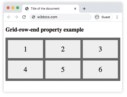
Here, we have specified the grid-row-end property as “auto”. In the next example, three items are spanned.
Example of the grid-row-end property specified as “span 3”:
<!DOCTYPE html>
<html>
  <head>
    <title>Title of the document</title>
    <style>
      .grid-container {
        display: grid;
        grid-template-columns: auto auto auto;
        grid-gap: 10px;
        background-color: #666;
        padding: 10px;
      }
      .grid-container > div {
        background-color: #eee;
        text-align: center;
        padding: 20px 0;
        font-size: 30px;
      }
      .box {
        grid-row-end: span 3;
      }
    </style>
  </head>
  <body>
    <h2>Grid-row-end property example</h2>
    <div class="grid-container">
      <div>1</div>
      <div class="box">2</div>
      <div>3</div>
      <div>4</div>
      <div>5</div>
      <div>6</div>
    </div>
  </body>
</html>