The grid-row-gap property sets the gap size between the rows of grid elements. The gap width can be specified, separating the rows by using a value for grid-row-gap.
It can be specified both in “px” and percentages.
| Initial Value | 0 |
| Applies to | Multi-column elements, flex containers, grid containers. |
| Inherited | No. |
| Animatable | Yes. Gap between the rows is animatable. |
| Version | CSS Grid Layout Module Level 1 |
| DOM Syntax | object.style.gridRowGap = “30px”; |
Syntax
grid-row-gap: normal | length;Example of the grid-row-gap property:
<!DOCTYPE html>
<html>
  <head>
    <title>Title of the document</title>
    <style>
      .grid-container {
        display: grid;
        grid-template-columns: auto auto auto auto;
        grid-column-gap: 20px;
        grid-row-gap: 0;
        background-color: #666;
        padding: 10px;
      }
      .grid-container > div {
        background-color: #eee;
        text-align: center;
        padding: 20px 0;
        font-size: 30px;
      }
    </style>
  </head>
  <body>
    <h2>Grid-row-gap property example</h2>
    <div class="grid-container">
      <div>1</div>
      <div>2</div>
      <div>3</div>
      <div>4</div>
      <div>5</div>
      <div>6</div>
      <div>7</div>
      <div class="box8">8</div>
    </div>
  </body>
</html>
Result
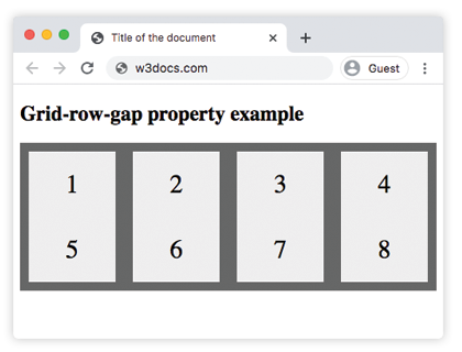
Here, the gap between rows is specified as 0. In the next example, the gap between rows is 40px.
Example of the grid-row-gap property specified in pixels:
<!DOCTYPE html>
<html>
  <head>
    <title>Title of the document</title>
    <style>
      .grid-container {
        display: grid;
        grid-template-columns: auto auto auto auto;
        grid-column-gap: 20px;
        grid-row-gap: 40px;
        background-color: #666;
        padding: 10px;
      }
      .grid-container > div {
        background-color: #eee;
        text-align: center;
        padding: 20px 0;
        font-size: 30px;
      }
    </style>
  </head>
  <body>
    <h2>Grid-row-gap property example</h2>
    <div class="grid-container">
      <div>1</div>
      <div>2</div>
      <div>3</div>
      <div>4</div>
      <div>5</div>
      <div>6</div>
      <div>7</div>
      <div>8</div>
      <div>9</div>
      <div>10</div>
      <div>11</div>
      <div>12</div>
    </div>
  </body>
</html>
Example of the grid-row-gap property specified in percentage:
<!DOCTYPE html>
<html>
  <head>
    <title>Title of the document</title>
    <style>
      .grid-container {
        display: grid;
        grid-template-columns: auto auto auto;
        grid-row-gap: 15%;
        grid-column-gap: 3%;
        background-color: grey;
        padding: 40px;
      }
      .grid-container > div {
        background-color: white;
        text-align: center;
        padding: 25px;
        font-size: 20px;
      }
    </style>
  </head>
  <body>
    <div class="grid-container">
      <div>1</div>
      <div>2</div>
      <div>3</div>
      <div>4</div>
      <div>5</div>
    </div>
  </body>
</html>