The grid-template property defines the grid columns, rows and areas. It is a shorthand property for the following properties:
- grid-template-rows
- grid-template-columns
- grid-template-areas
The grid-template property sets the rows and columns, separated by a forward slash.
The CSS grid shorthand property resets grid properties to their first values. If you don’t want these values cascade in separately, instead of the grid-template property use the grid property.
| Initial Value | none none none |
| Applies to | Grid containers. |
| Inherited | No. |
| Animatable | Yes. Grid layout is animatable. |
| Version | CSS Grid Layout Module Level 1 |
| DOM Syntax | object.style.gridTemplate =”100px / auto auto”; |
Syntax
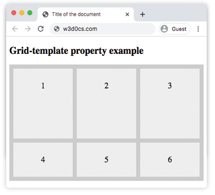
grid-template: none | grid-template-rows / grid-template-columns | grid-template-areas | initial | inherit;Example of the grid-template property:
<!DOCTYPE html>
<html>
  <head>
    <title>Title of the document</title>
    <style>
      .grid-container {
        display: grid;
        grid-template: 170px / auto auto auto;
        grid-gap: 10px;
        background-color: #ccc;
        padding: 10px;
      }
      .grid-container > div {
        background-color: #eee;
        text-align: center;
        padding: 30px 0;
        font-size: 20px;
      }
    </style>
  </head>
  <body>
    <h2>Grid-template property example</h2>
    <div class="grid-container">
      <div>1</div>
      <div>2</div>
      <div>3</div>
      <div>4</div>
      <div>5</div>
      <div>6</div>
    </div>
  </body>
</html>
Result
Example of the grid-template property, where “item1” name is given to a grid item:
<!DOCTYPE html>
<html>
  <head>
    <title>Title of the document</title>
    <style>
      .box {
        grid-area: item1;
      }
      .grid-container {
        display: grid;
        grid-template: 'item1 item1 . .' 'item1 item1 . .';
        grid-gap: 10px;
        background-color: #ccc;
        padding: 10px;
      }
      .grid-container > div {
        background-color: #eee;
        text-align: center;
        padding: 30px 0;
        font-size: 20px;
      }
    </style>
  </head>
  <body>
    <h2>Grid-template property example</h2>
    <div class="grid-container">
      <div class="box">1</div>
      <div>2</div>
      <div>3</div>
      <div>4</div>
      <div>5</div>
      <div>6</div>
    </div>
  </body>
</html>