With the help of the CSS transform property, a 2D or 3D transformation is applied to the element. It is one of the CSS3 properties. This property allows to rotate, skew, scale or translate the element. It takes none value or from the list of transform functions.
Only the box model positioned elements can be transformed.
| Initial Value | none |
| Applies to | Transformable elements. |
| Inherited | No. |
| Animatable | Yes. Degree is animatable. |
| Version | CSS3 |
| DOM Syntax | Object.style.transform = “rotate(10deg)”; |
Syntax
transform: none | transform-functions | initial | inherit;Example of the transform property:
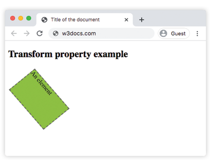
<!DOCTYPE html>
<html>
  <head>
    <title>Title of the document</title>
    <style>
      div {
        border: 2px dashed #666;
        background-color: #8ebf42;
        transform: translate(10px, 40px) rotate(50deg);
        width: 130px;
        height: 80px;
      }
    </style>
  </head>
  <body>
    <h2>Transform property example</h2>
    <div>An element</div>
  </body>
</html>
Result
Example of the transform property with the “rotate”, “skewY”, “scaleY”, “translateX”, “skew” values:
<!DOCTYPE html>
<html>
  <head>
    <title>Title of the document</title>
    <style>
      div {
        margin: 35px 20px;
      }
      div.box1 {
        width: 130px;
        height: 80px;
        border: 1px solid #000;
        background-color: #1c87c9;
        -ms-transform: rotate(30deg);
        -webkit-transform: rotate(30deg);
        transform: rotate(30deg);
      }
      div.box2 {
        width: 120px;
        height: 80px;
        border: 1px solid #000;
        background-color: #8ebf42;
        -ms-transform: skewY(30deg);
        -webkit-transform: skewY(30deg);
        transform: skewY(30deg);
      }
      div.box3 {
        width: 160px;
        height: 80px;
        border: 1px solid #000;
        background-color: #FFFF00;
        -ms-transform: scaleY(1);
        -webkit-transform: scaleY(1);
        transform: scaleY(1);
      }
      div.box4 {
        width: 160px;
        height: 80px;
        border: 1px solid #000;
        background-color: #ccc;
        -ms-transform: rotate(160deg);
        -webkit-transform: rotate(160deg);
        transform: rotate(160deg);
      }
      div.box5 {
        width: 160px;
        height: 80px;
        border: 1px solid #000;
        background-color: #990099;
        -ms-transform: translateX(50px);
        -webkit-transform: translate(50px);
        transform: translateX(50px);
      }
      div.box6 {
        width: 160px;
        height: 80px;
        border: 1px solid #000;
        background-color: #FF0000;
        -ms-transform: skew(170deg, 170deg);
        -webkit-transform: skew(170deg, 170deg);
        transform: skew(170deg, 170deg);
      }
    </style>
  </head>
  <body>
    <h2>Transform property example</h2>
    <h3>transform: rotate(30deg):</h3>
    <div class="box1"></div>
    <h3>transform: skewY(30deg):</h3>
    <div class="box2"></div>
    <h3>transform: scaleY(1):</h3>
    <div class="box3"></div>
    <h3>transform: transform:rotate(160deg):</h3>
    <div class="box4"></div>
    <h3>transform: translateX(50px):</h3>
    <div class="box5"></div>
    <h3>transform: skew(170deg,170deg):</h3>
    <div class="box6"></div>
  </body>
</html>
In the given example, for maximum browser compatibility the -webkit- for Safari, Google Chrome, and Opera extensions are used.
The “skew” value
The “skewX” and “skewY” transform values are used for somehow tilting an element. There doesn’t exist any shorthand property to skew an element, that’s why both of these values are used.
The “rotate” value
With the help of the “rotate” value, the element is rotated clockwise from the original position. In case of using a negative value, it will be rotated in the opposite direction.
The “translate” value
The “translate” value is used for moving the element up or down, as well as sideways. More values are presented below.