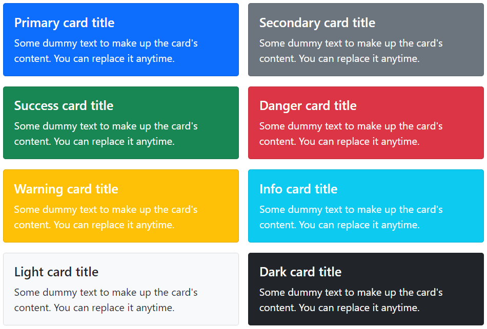
There are several options available for customizing the card’s backgrounds, borders, and color.
Customizing Background and Color
You can simply use the background and color utility classes to change the appearance of a card. Let’s try out the following example to understand how it basically works:
Example
<div class="row">
    <div class="col-6">
        <div class="card text-white bg-primary mb-4">
            <div class="card-body">
                <h5 class="card-title">Primary card title</h5>
                <p class="card-text">Some dummy text to make up the card's content. You can replace it anytime.</p>
            </div>
        </div>
    </div>
    <div class="col-6">
        <div class="card text-white bg-secondary mb-4">
            <div class="card-body">
                <h5 class="card-title">Secondary card title</h5>
                <p class="card-text">Some dummy text to make up the card's content. You can replace it anytime.</p>
            </div>
        </div>
    </div>
    <div class="col-6">
        <div class="card text-white bg-success mb-4">
            <div class="card-body">
                <h5 class="card-title">Success card title</h5>
                <p class="card-text">Some dummy text to make up the card's content. You can replace it anytime.</p>
            </div>
        </div>
    </div>
    <div class="col-6">
        <div class="card text-white bg-danger mb-4">
            <div class="card-body">
                <h5 class="card-title">Danger card title</h5>
                <p class="card-text">Some dummy text to make up the card's content. You can replace it anytime.</p>
            </div>
        </div>
    </div>
    <div class="col-6">
        <div class="card text-white bg-warning mb-4">
            <div class="card-body">
                <h5 class="card-title">Warning card title</h5>
                <p class="card-text">Some dummy text to make up the card's content. You can replace it anytime.</p>
            </div>
        </div>
    </div>
    <div class="col-6">
        <div class="card text-white bg-info mb-4">
            <div class="card-body">
                <h5 class="card-title">Info card title</h5>
                <p class="card-text">Some dummy text to make up the card's content. You can replace it anytime.</p>
            </div>
        </div>
    </div>
    <div class="col-6">
        <div class="card text-white bg-dark">
            <div class="card-body">
                <h5 class="card-title">Dark card title</h5>
                <p class="card-text">Some dummy text to make up the card's content. You can replace it anytime.</p>
            </div>
        </div>
    </div>
    <div class="col-6">
        <div class="card bg-light">
            <div class="card-body">
                <h5 class="card-title">Light card title</h5>
                <p class="card-text">Some dummy text to make up the card's content. You can replace it anytime.</p>
            </div>
        </div>
    </div>
</div>
— The output of the above example will look something like this:
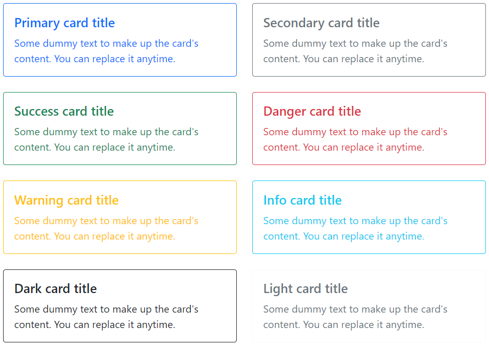
Customizing Border and Color
Similarly, you can customize the border and text color of any card using the text and border utility classes. Just apply these classes on the .card or its child elements, as shown below:
Example
<div class="row">
    <div class="col-6">
        <div class="card border-primary mb-4">
            <div class="card-body text-primary">
                <h5 class="card-title">Primary card title</h5>
                <p class="card-text">Some dummy text to make up the card's content. You can replace it anytime.</p>
            </div>
        </div>
    </div>
    <div class="col-6">
        <div class="card border-secondary mb-4">
            <div class="card-body text-secondary">
                <h5 class="card-title">Secondary card title</h5>
                <p class="card-text">Some dummy text to make up the card's content. You can replace it anytime.</p>
            </div>
        </div>
    </div>
    <div class="col-6">
        <div class="card border-success mb-4">
            <div class="card-body text-success">
                <h5 class="card-title">Success card title</h5>
                <p class="card-text">Some dummy text to make up the card's content. You can replace it anytime.</p>
            </div>
        </div>
    </div>
    <div class="col-6">
        <div class="card border-danger mb-4">
            <div class="card-body text-danger">
                <h5 class="card-title">Danger card title</h5>
                <p class="card-text">Some dummy text to make up the card's content. You can replace it anytime.</p>
            </div>
        </div>
    </div>
    <div class="col-6">
        <div class="card border-warning mb-4">
            <div class="card-body text-warning">
                <h5 class="card-title">Warning card title</h5>
                <p class="card-text">Some dummy text to make up the card's content. You can replace it anytime.</p>
            </div>
        </div>
    </div>
    <div class="col-6">
        <div class="card border-info mb-4">
            <div class="card-body text-info">
                <h5 class="card-title">Info card title</h5>
                <p class="card-text">Some dummy text to make up the card's content. You can replace it anytime.</p>
            </div>
        </div>
    </div>
    <div class="col-6">
        <div class="card border-dark mb-4">
            <div class="card-body text-dark">
                <h5 class="card-title">Dark card title</h5>
                <p class="card-text">Some dummy text to make up the card's content. You can replace it anytime.</p>
            </div>
        </div>
    </div>
    <div class="col-6">
        <div class="card border-light mb-4">
            <div class="card-body text-muted">
                <h5 class="card-title">Light card title</h5>
                <p class="card-text">Some dummy text to make up the card's content. You can replace it anytime.</p>
            </div>
        </div>
    </div>
</div>
— The output of the above example will look something like this:
Card Layout Options
In addition to styling of the cards, Bootstrap also includes a few options for laying out the series of cards. However, these layouts are not responsive yet.
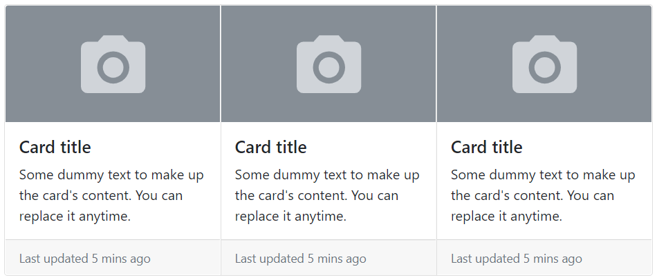
Creating the Card Groups
You can use card groups to render cards as a single, attached element with equal width and height columns. However, cards inside a card group become horizontally stacked on extra small devices (i.e. viewport width <576px). Let’s try out an example and see how it actually works:
Example
<div class="card-group">
    <div class="card">
        <img src="images/thumbnail.svg" class="card-img-top" alt="...">
        <div class="card-body">
            <h5 class="card-title">Card title</h5>
            <p class="card-text">Some dummy text to make up the card's content. You can replace it anytime.</p>
        </div>
        <div class="card-footer">
            <small class="text-muted">Last updated 5 mins ago</small>
        </div>
    </div>
</div>
— The output of the above example will look something like this:
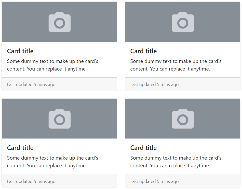
Creating the Card Grids
You can use the Bootstrap grid system and its .row-cols-* classes to control how many grid columns (wrapped around your cards) to show per row. For example, you can use the class .row-cols-1 to show one card per row, similarly you can use the class .row-cols-md-2 to show two cards per row, from the medium breakpoint up (i.e. viewport width ≥768px).
Example
<div class="row row-cols-1 row-cols-md-2 g-4">
    <div class="col">
        <div class="card">
            <img src="images/thumbnail.svg" class="card-img-top" alt="...">
            <div class="card-body">
                <h5 class="card-title">Card title</h5>
                <p class="card-text">Some dummy text to make up the card's content. You can replace it anytime.</p>
            </div>
            <div class="card-footer">
                <small class="text-muted">Last updated 5 mins ago</small>
            </div>
        </div>
    </div>
</div>
— The output of the above example will look something like this:
Creating Horizontal Cards
You can also create horizontal cards where image and text content are placed side-by-side using a combination of grid and utility classes, as shown in the following example:
Example
<div class="card" style="max-width: 500px;">
    <div class="row g-0">
        <div class="col-sm-5">
            <img src="images/sample.svg" class="card-img-top h-100" alt="...">
        </div>
        <div class="col-sm-7">
            <div class="card-body">
                <h5 class="card-title">Alice Liddel</h5>
                <p class="card-text">Alice is a freelance web designer and developer based in London. She is specialized in HTML5, CSS3, JavaScript, Bootstrap, etc.</p>
                <a href="#" class="btn btn-primary stretched-link">View Profile</a>
            </div>
        </div>
    </div>
</div>
— The output of the above example will look something like this:

Card Image Overlays
You can even turn an image into a card background and place the card’s text on the top it using the class .card-img-overlay in place of .card-body. Depending on the image, you may need additional styles for better adjustments. Let’s check out an example:
Example
<div class="card text-white" style="width: 350px;">
    <img src="images/sample.svg" class="card-img-top" alt="...">
    <div class="card-img-overlay">
        <h5 class="card-title">Alice Liddel</h5>
        <p class="card-text">Alice is a freelance web designer and developer based in London. She is specialized in HTML5, CSS3, JavaScript, Bootstrap, etc.</p>
        <a href="#" class="btn btn-primary stretched-link">View Profile</a>
    </div>
</div>
— The output of the above example will look something like this:
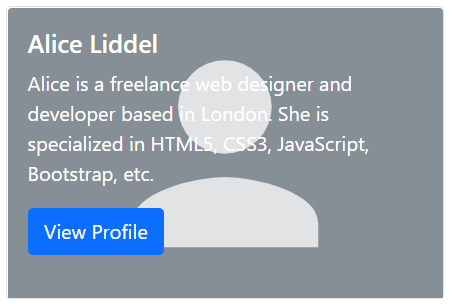
Note: The card content should not be larger than the height of the image. If content is larger than the image the content will be displayed outside the image.
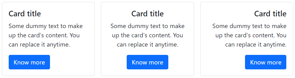
Text Alignment inside Card
You can easily change the text alignment of any card—entirely or specific parts—with the text alignment utility classes. For example, you can use the class .text-center and .text-end to align the card’s text content to the center and to the right end, respectively.
Example
<div class="row row-cols-1 row-cols-md-3 g-3">
    <div class="col">
        <!-- Card with default left text alignment -->
        <div class="card">
            <div class="card-body">
                <h5 class="card-title">Card title</h5>
                <p class="card-text">Some dummy text to make up the card's content. You can replace it anytime.</p>
                <a href="#" class="btn btn-primary">Know more</a>
            </div>
        </div>
    </div>
    <div class="col">
        <!-- Card with center text alignment -->
        <div class="card text-center">
            <div class="card-body">
                <h5 class="card-title">Card title</h5>
                <p class="card-text">Some dummy text to make up the card's content. You can replace it anytime.</p>
                <a href="#" class="btn btn-primary">Know more</a>
            </div>
        </div>
    </div>
    <div class="col">
    <!-- Card with right text alignment -->
        <div class="card text-end">
            <div class="card-body">
                <h5 class="card-title">Card title</h5>
                <p class="card-text">Some dummy text to make up the card's content. You can replace it anytime.</p>
                <a href="#" class="btn btn-primary">Know more</a>
            </div>
        </div>
    </div>
</div>
— The output of the above example will look something like this: