Similar to the solid colors, you can also create different colored striped progress bars using the same background color utility classes. Let’s take a look at the following example:
Example
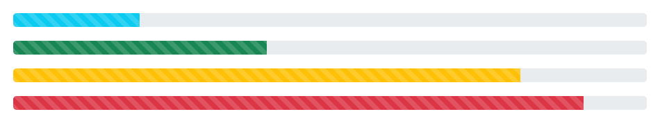
<div class="progress">
    <div class="progress-bar progress-bar-striped bg-info" style="width: 20%"></div>
</div>
<div class="progress">
    <div class="progress-bar progress-bar-striped bg-success" style="width: 40%"></div>
</div>
<div class="progress">
    <div class="progress-bar progress-bar-striped bg-warning" style="width: 80%"></div>
</div>
<div class="progress">
    <div class="progress-bar progress-bar-striped bg-danger" style="width: 90%"></div>
</div>
— The output of the above example will look something like this: