If you want to create a horizontal menu using the ordered or unordered list you need to place all list items in a single line (i.e. side by side). You can do this simply by adding the class .list-inline to the <ul> or <ol>, and the class .list-inline-item to the child <li> elements.
Example
<ul class="list-inline">
    <li class="list-inline-item">Home</li>
    <li class="list-inline-item">Products</li>
    <li class="list-inline-item">About Us</li>
    <li class="list-inline-item">Contact</li>
</ul>
— The output of the above example will look something like this:

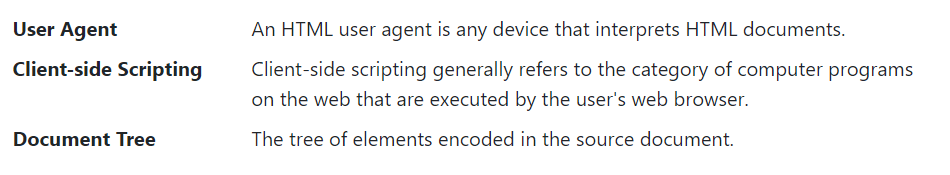
Creating Horizontal Definition Lists
The terms and descriptions in a definition list can also be aligned horizontally side-by-side using the Bootstrap grid system’s predefined classes. Here’s an example:
Example
<dl class="row">
    <dt class="col-sm-3">User Agent</dt>
    <dd class="col-sm-9">An HTML user agent is any device that interprets HTML documents.</dd>
    <dt class="col-sm-3 text-truncate">Client-side Scripting</dt>
    <dd class="col-sm-9">Client-side scripting generally refers to the category of computer programs on the web that are executed by the user's web browser.</dd>
    <dt class="col-sm-3">Document Tree</dt>
    <dd class="col-sm-9">The tree of elements encoded in the source document.</dd>
</dl>
— The output of the above example will look something like this:
Note: For longer definition terms, you can optionally apply the class .text-truncate on the <dt> element to truncate the text with an ellipsis (…).